

About
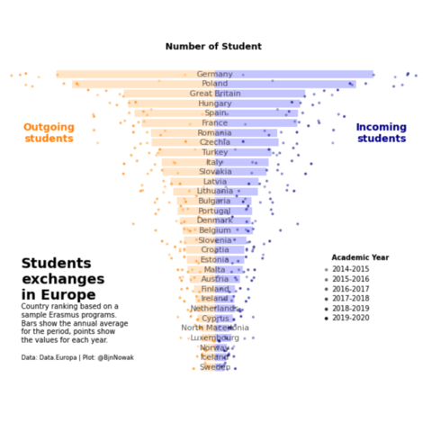
This plot is a mirror barplot. It shows the number of outgoing and incoming students in different countries. Each bar is the average of the country, and the points the values for each year.
The chart was originally made with R. This post is a translation to Python by Joseph B..
Thanks to him for accepting sharing his work here!
Let's see what the final picture will look like:
Libraries
First, you need to install the following librairies:
- matplotlib is used for creating the chart and add customization features
pandasis used to put the data into a dataframe and data manipulationnumpyis used for adding noise to the positions of each marker
And that's it!
# Libraries
import pandas as pd
import numpy as np
import matplotlib.pyplot as plt
Dataset
For this reproduction, we're going to retrieve the data directly from the gallery's Github repo. This means we just need to give the right url as an argument to pandas' read_csv() function to retrieve the data.
# URLs
resume_url = 'https://raw.githubusercontent.com/holtzy/the-python-graph-gallery/master/static/data/resume.csv'
erasmus_url = 'https://raw.githubusercontent.com/holtzy/the-python-graph-gallery/master/static/data/erasmus.csv'

# load datasets
resume = pd.read_csv(resume_url)
data = pd.read_csv(erasmus_url)
Ordered barplot
First, let's create the barplots without so much customization.
In order to have the barplots side by side, we just have to specify than the second one will be in negative (-resume['mean_send'] when using the barh() function). Moreover, since we ordered before our dataset by the mean_send column, it will automatically be in the right order (decreasing).
The alpha argument defines the opacity of the bars (between 0 and 1).
# Create a figure and axis with a specific size
fig, ax = plt.subplots(figsize=(6, 6))

# Create both barplots
ax.barh(resume['country_name'], resume['mean_rec'],
        color='blue', alpha=0.3)
ax.barh(resume['country_name'], -resume['mean_send'],
        color='darkorange', alpha=0.3)

# Add a title
ax.set_title('Number of Student', weight='bold')

# Display the plot
plt.show()
Remove spines and shift country names
In this step, we will remove the spines (border of the graph) and put the country names on each bar
- remove label using
ax.set_xticks([]) - remove spines using
ax.spines[['right', 'top', 'left', 'bottom']].set_visible(False) - add labels on the center using the
text()function
# Create a figure and axis with a specific size
fig, ax = plt.subplots(figsize=(6, 6))

# Create both barplots
ax.barh(resume['country_name'], resume['mean_rec'],
        color='blue', alpha=0.3)
ax.barh(resume['country_name'], -resume['mean_send'],
        color='darkorange', alpha=0.3)

# Remove axis labels
ax.set_xticks([])
ax.set_yticks([])

# Removes spines
ax.spines[['right', 'top', 'left', 'bottom']].set_visible(False)

# Put country names on the center of the chart
for i, country_name in enumerate(resume['country_name']):
    ax.text(0, i, country_name, ha='center', va='center', fontsize=8, alpha=0.6)

# Add a title
ax.set_title('Number of Student', weight='bold', fontsize=9)

# Display the plot
plt.show()
Add individual points
The peculiarity of the points in this graph is linked to 2 things:
- their position on the y-axis, which is different for each country
- their opacity, which depends on the year concerned
In practice, we iterate over the rows of our data dataframe (thanks to iterrows()) that we haven't used until now, retrieving positions and opacity according to country name and year.
For visual purpose, we add a very small noise to the y_position so that the points are slightly burst.
# Create a figure and axis with a specific size
fig, ax = plt.subplots(figsize=(6, 6))

# Create both barplots
ax.barh(resume['country_name'], resume['mean_rec'],
        color='blue', alpha=0.3)
ax.barh(resume['country_name'], -resume['mean_send'],
        color='darkorange', alpha=0.3)

# Remove axis labels
ax.set_xticks([])
ax.set_yticks([])

# Removes spines
ax.spines[['right', 'top', 'left', 'bottom']].set_visible(False)

# Put country names on the center of the chart
for i, country_name in enumerate(resume['country_name']):
    ax.text(0, i, country_name, ha='center', va='center', fontsize=8, alpha=0.6)

# Add each observations, for each year and country
y_position = 0
for i, row in data.iterrows():

    # Get values
    sending = -row['participants_x']
    receiving = row['participants_y']
    y_position = row['y_position']
    years = row['academic_year']

    # Change alpha parameter according to the year concerned
    year_alpha_mapping = {'2014-2015': 0.3,
                          '2015-2016': 0.4,
                          '2016-2017': 0.5,
                          '2017-2018': 0.6,
                          '2018-2019': 0.7,
                          '2019-2020': 0.9}
    alpha = year_alpha_mapping[years]*0.6 # adjust as needed

    # Add small noise to the y_position
    y_position += np.random.normal(0, 0.1, 1)

    # Add
    ax.scatter(sending, y_position, c='darkorange', alpha=alpha, s=3)
    ax.scatter(receiving, y_position, c='darkblue', alpha=alpha, s=3)


# Add a title
ax.set_title('Number of Student', weight='bold', fontsize=9)

# Display the plot
plt.show()
Add annotations for final chart
All that's missing is a few annotations, but the hard part's over!
Thanks to the text() function, you can easily add annotations of different sizes and styles.
# Create a figure and axis with a specific size
fig, ax = plt.subplots(figsize=(8, 6))

# Create both barplots
ax.barh(resume['country_name'], resume['mean_rec'],
        color='blue', alpha=0.2)
ax.barh(resume['country_name'], -resume['mean_send'],
        color='darkorange', alpha=0.2)

# Remove axis labels
ax.set_xticks([])
ax.set_yticks([])

# Removes spines
ax.spines[['right', 'top', 'left', 'bottom']].set_visible(False)

# Put country names on the center of the chart
for i, country_name in enumerate(resume['country_name']):
    ax.text(0, i, country_name, ha='center', va='center', fontsize=8, alpha=0.6)

# Add each observations, for each year and country
y_position = 0
for i, row in data.iterrows():

    # Get values
    sending = -row['participants_x']
    receiving = row['participants_y']
    y_position = row['y_position']
    years = row['academic_year']

    # Change alpha parameter according to the year concerned
    year_alpha_mapping = {'2014-2015': 0.3,
                          '2015-2016': 0.4,
                          '2016-2017': 0.5,
                          '2017-2018': 0.6,
                          '2018-2019': 0.7,
                          '2019-2020': 0.9}
    alpha = year_alpha_mapping[years]*0.6

    # Add small noise to the y_position
    y_position += np.random.normal(0, 0.2, 1)

    # Add
    ax.scatter(sending, y_position, c='darkorange', alpha=alpha, s=3)
    ax.scatter(receiving, y_position, c='darkblue', alpha=alpha, s=3)


# Label of Outgoing and Incoming students
ax.text(-6000, 24, 'Outgoing\nstudents',
        color='darkorange', ha='center', va='center', weight='bold')
ax.text(6000, 24, 'Incoming\nstudents',
        color='darkblue', ha='center', va='center', weight='bold')

# big title
ax.text(-7000, 9, 'Students\nexchanges\nin Europe',
        ha='left', va='center', weight='bold', fontsize=14)

# description
text = '''Country ranking based on a
sample Erasmus programs.
Bars show the annual average
for the period, points show
the values for each year.'''
ax.text(-7000, 4.5, text, ha='left', va='center', fontsize=7)

# credits
text = '''Data: Data.Europa | Plot: @BjnNowak'''
ax.text(-7000, 1, text, ha='left', va='center', fontsize=6)

# Academic year legend
ax.text(x=4200, y=11, s='Academic Year', fontsize=7, weight='bold')
y_position = 10 # start at the 10th bar
for year, alpha in year_alpha_mapping.items():

    # Add the point
    ax.scatter(4000, y_position, alpha=alpha, s=5, c='black')
    ax.text(x=4200, y=y_position-0.2, s=year, fontsize=7)

    y_position -= 1 # decrease of one bar for the next iteration

# Add a title at the top
ax.set_title('Number of Student', weight='bold', fontsize=9)

# Display the plot
plt.show()
Going further
This article explains how to reproduce a mirror barplot with annotations, individual observations, custom style and nice features.
For more examples of advanced customization in barplot, check out this circular barplot. Also, you might be interested in creating advanced annotations.


