About
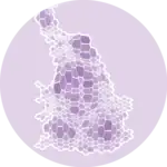
A choropleth map is a map combined where colors are proportional to values in each region.
This chart has been created by Koen Van den Eeckhout, and translated to Python by Joseph Barbier.
Libraries
First, we need to load the following libraries:
import pandas as pd
import cartopy.crs as ccrs
import geopandas as gpd
import matplotlib.pyplot as plt
from pypalettes import create_cmap
from pyfonts import load_google_font
import unicodedatadef remove_accents(text):
return "".join(
c if not unicodedata.combining(c) else ""
for c in unicodedata.normalize("NFKD", text)
)
belgium = gpd.read_file(
"https://raw.githubusercontent.com/holtzy/The-Python-Graph-Gallery/refs/heads/master/static/data/belgium.json",
layer="municipalities",
).drop(
columns=[
"prov_nis",
"prov_fr",
"prov_nl",
"arr_nis",
"id",
"reg_nis",
"reg_nl",
"reg_fr",
"arr_fr",
"arr_nl",
"nis",
]
)
belgium["name_nl"] = belgium["name_nl"].apply(remove_accents).str.lower()
rates = pd.read_csv(
"https://raw.githubusercontent.com/holtzy/The-Python-Graph-Gallery/refs/heads/master/static/data/belgium-unemployment.csv"
)
rates["Gemeente"] = rates["Gemeente"].apply(remove_accents).str.lower()
df = belgium.merge(rates, left_on="name_nl", right_on="Gemeente", how="left")
projection = ccrs.Mercator()
df.crs = "EPSG:4326"
df = df.to_crs(projection.proj4_init)
df.head()| name_fr | name_nl | population | geometry | Gemeente | Werkloosheidsgraad | |
|---|---|---|---|---|---|---|
| 0 | Anderlecht | anderlecht | 120887 | POLYGON ((476375.417 6554451.799, 476075.149 6... | anderlecht | 15.72 |
| 1 | Bruxelles | brussel | 185103 | POLYGON ((482638.162 6561047.697, 482766.849 6... | brussel | 15.83 |
| 2 | Ixelles | elsene | 87632 | MULTIPOLYGON (((489158.281 6555474.343, 489029... | elsene | 11.87 |
| 3 | Etterbeek | etterbeek | 48473 | POLYGON ((490488.042 6559495.241, 490445.146 6... | etterbeek | 9.66 |
| 4 | Evere | evere | 42656 | POLYGON ((492461.236 6563624.014, 492332.549 6... | evere | 11.90 |
Basic choropleth map
The key steps here are:
- create a colormap (
cmap) with the color range we want - create a matplotlib Figure with
fig, ax = plt.subplots() - plot the choropleth map with
df.plot()
cmap = create_cmap(
    colors=[
        "#FCFCBD",
        "#FED69A",
        "#FDC48C",
        "#FB9A70",
        "#C74370",
        "#9D2D7A",
        "#86277A",
        "#661d5c",
        "#5A1A74",
    ],
    cmap_type="continuous",
    name="Sunset3",
)

fig, ax = plt.subplots(subplot_kw={"projection": projection}, dpi=300)
ax.axis("off")

df.plot(ax=ax, column="Werkloosheidsgraad", cmap=cmap, edgecolor="#e6e6e6", lw=0.3)
plt.show()

Add barplot
In order to add the barplot, we use the ax.inset_axes() function to create a subplot (smaller) that will contain our barplot.
If you're not familiar with complex layouts in Matplotlib, please check this dedicated lesson where we explain the concept in depth!
Then we customize it a bit so that it uses the right color scale and looks nice.
cmap = create_cmap(
    colors=[
        "#5A1A74",
        "#661d5c",
        "#86277A",
        "#9D2D7A",
        "#C74370",
        "#FB9A70",
        "#FDC48C",
        "#FED69A",
        "#FCFCBD",
    ][::-1],
    cmap_type="continuous",
    name="Sunset3",
)

fig, ax = plt.subplots(subplot_kw={"projection": projection}, dpi=300)
ax.axis("off")

df.plot(ax=ax, column="Werkloosheidsgraad", cmap=cmap, edgecolor="#e6e6e6", lw=0.3)

# Add barplot
bar_ax = ax.inset_axes(bounds=[0.05, 0.15, 0.4, 0.3], zorder=-1)
n, bins, _ = bar_ax.hist(df["Werkloosheidsgraad"], bins=18, alpha=0)
colors = [cmap((val - min(bins)) / (max(bins) - min(bins))) for val in bins]
bar_ax.bar(bins[:-1], n, color=colors)
bar_ax.spines[["top", "left", "right"]].set_visible(False)
bar_ax.set_yticks([])
x_ticks = list(range(0, 19, 3))
bar_ax.set_xticks(x_ticks, labels=["0", "3", "6", "9", "12", "15", "18%"], size=8)
bar_ax.tick_params(axis="x", length=2)

plt.show()

Add annotations
The final step is to add the annotations: title, subtitle and credit. The steps are:
- load a regular and a bold font thanks to
load_google_font()frompyfonts - use the
fig.text()a few times to add the texts at the right places
regular = load_google_font("Roboto")
bold = load_google_font("Roboto", weight="bold")

cmap = create_cmap(
    colors=[
        "#5A1A74",
        "#661d5c",
        "#86277A",
        "#9D2D7A",
        "#C74370",
        "#FB9A70",
        "#FDC48C",
        "#FED69A",
        "#FCFCBD",
    ][::-1],
    cmap_type="continuous",
    name="Sunset3",
)

fig, ax = plt.subplots(subplot_kw={"projection": projection}, dpi=300)
ax.axis("off")

df.plot(
    ax=ax,
    column="Werkloosheidsgraad",
    cmap=cmap,
    edgecolor="#e6e6e6",
    lw=0.3,
)

bar_ax = ax.inset_axes(bounds=[0.05, 0.15, 0.4, 0.3], zorder=-1)
n, bins, _ = bar_ax.hist(df["Werkloosheidsgraad"], bins=18, alpha=0)
colors = [cmap((val - min(bins)) / (max(bins) - min(bins))) for val in bins]
bar_ax.bar(bins[:-1], n, color=colors)
bar_ax.spines[["top", "left", "right"]].set_visible(False)
bar_ax.set_yticks([])
x_ticks = list(range(0, 19, 3))
bar_ax.set_xticks(x_ticks, labels=["0", "3", "6", "9", "12", "15", "18%"], size=8)
bar_ax.tick_params(axis="x", length=2)

fig.text(x=0.2, y=0.89, s="Unemployment rate in Belgium", size=12, font=bold)
fig.text(x=0.2, y=0.86, s="By municipality, in December 2024", size=8, font=regular)
fig.text(
    x=0.2,
    y=0.13,
    s="Map: Koen Van den Eeckhout · Source: RVA (Interactive Statistics)",
    size=6,
    color="#909090",
    font=regular,
)

plt.savefig(
    "../../static/graph/web-choropleth-map-with-barplot.png",
    dpi=300,
    bbox_inches="tight",
)
Going further
You might be interested in:
- the choropleth map section of the gallery
- this other choropleth + barplot example
- how to create an interactive choropleth map
- learn matplotlib easily with Matplotlib Journey