Sankey diagram

A Sankey Diagram is a visualisation technique that allows to display flows. Several entities (nodes) are represented by rectangles or text. Their links are represented with arrows or arcs that have a width proportional to the importance of the flow.
 Sankey diagram with
 Plotly
Plotly is an awesome Python library for interactive data visualization. It is most probably the best tool to create a Sankey Diagram. Its Sankey() function handles most of the business logic for you, allowing to get a figure in a couple of lines of code.
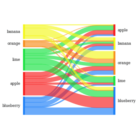
The blogpost linked below should quickly get you started with some minimal starting example. It also describes the most common of type of customization you probably want to apply to your Sankey diagram to make it appealing, and ends up with the code for a real life Sankey diagram shown below.
Sankey diagrams with pySankey
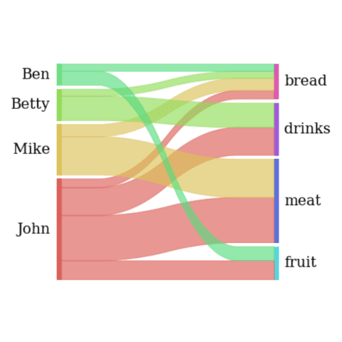
The pySankey python library by anazalea is another option when it comes to build sankey diagrams. It is based on matplotlib and aims a building static outputs only. The blogpost showcased below should help you to get started quickly, describing the various accepted dataset and the customization offered by the library.
 Sankey diagram with
 Matplotlib
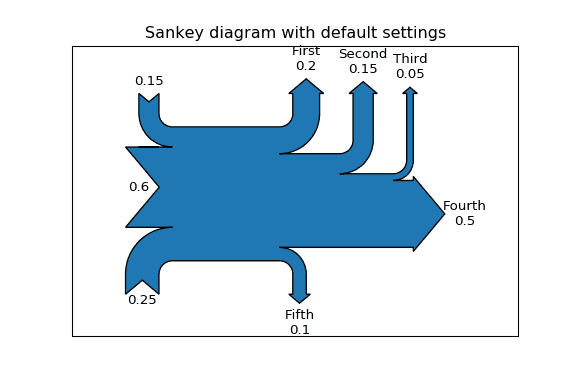
The matplotlib library offers a Sankey() function that also allows to build sankey diagrams. It is a bit limited in my opinion, since it only allows to visualize flows passing through one unique group as shown in the example below.
The example below comes from the official doc. Have a look to the code
🚨 Grab the Data To Viz poster!
Do you know all the chart types? Do you know which one you should pick? I made a decision tree that answers those questions. You can download it for free!


