Titles
In data visualization, titles, or annotations in general, have a major role in available information to the reader.
They can be used to:
- highlight specific points
- provide additional information
- simply explain the data in more depth
However, it can be quite technicaly challenging to customize annotations in matplotlib.
Let's see how we can create nice titles in a few examples.
Libraries
Default tools from matplotlib are unfortunately not enough to create nice titles, especially when using the title(). We will use the highlight-text package that simplifies the process.
Keep in mind that it would have been possible to use the flexitext package that can do approximately the same thing.
And we will also need to load matplotlib and numpy libraries.
import matplotlib.pyplot as plt
from highlight_text import fig_textCombine title and subtitle
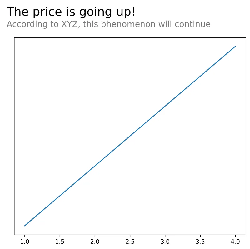
With matplotlib, the easiest way to combine a title and a subtitle is to use twice the text() function with different y values (position). However, it can be quite tricky to align them properly.
With highlight_text, we just have to pass different properties to our text to differentiate them to quickly create a title and a subtitle.
# create a simple plot
fig, ax = plt.subplots(figsize=(7,6), dpi=250)
ax.plot(
    [1, 2, 3, 4],
    [10, 11, 12, 13]
)

# remove y-axis ticks
ax.set_yticks([])

# add annotation on top
text = '<The price is going up!>\n<According to XYZ, this phenomenon will continue>'
fig_text(
    x=0.1, # position on x-axis
    y=1, # position on y-axis
    ha='left',
    s=text,
    fontsize=12,
    ax=ax,
    highlight_textprops=[
        {"color": "black", "fontsize": 20},
        {"color": "grey", "fontsize": 14}
    ]
)

plt.show()Colors
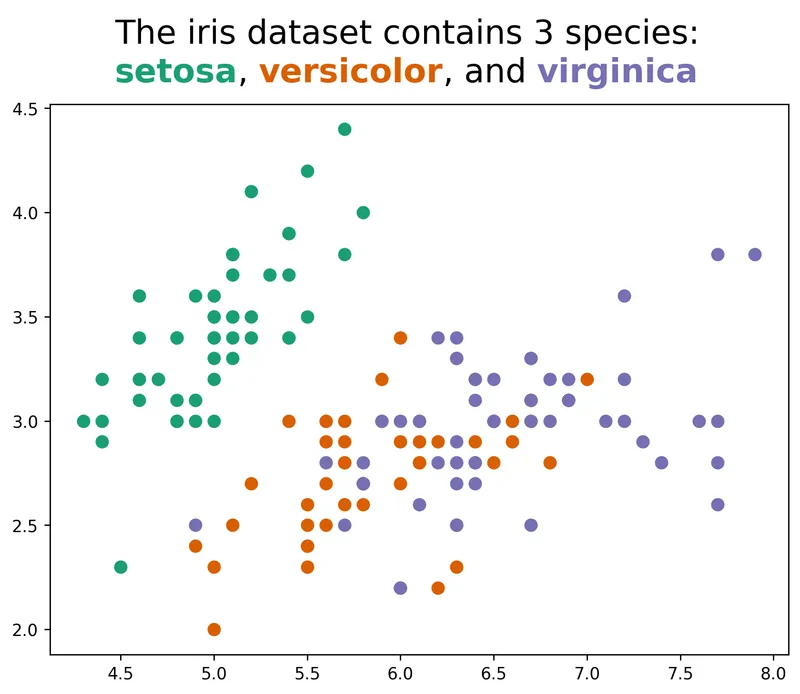
The highlight_text package also allows to color a specific part of the text. This is a great way to add insight and make your chart more understandable.
# dataset
import pandas as pd
dataset = 'master/static/data/iris.csv'
iris = pd.read_csv('https://raw.githubusercontent.com/holtzy/The-Python-Graph-Gallery/'+dataset)

fig, ax = plt.subplots(figsize=(8, 6), dpi=250)
colors = ["#1B9E77", "#D95F02", "#7570B3"]
for species, color in zip(iris['species'].unique(), colors):
    subset = iris[iris['species'] == species]
    ax.scatter(subset['sepal_length'], subset['sepal_width'], c=color, label=species, s=50)

text = 'The iris dataset contains 3 species:\n<setosa>, <versicolor>, and <virginica>'
fig_text(
    s=text,
    x=.5, y=1,
    fontsize=20,
    color='black',
    highlight_textprops=[{"color": colors[0], 'fontweight': 'bold'},
                         {"color": colors[1], 'fontweight': 'bold'},
                         {"color": colors[2], 'fontweight': 'bold'}],
    ha='center'
)

plt.show()Going further
This post explains how to create nice title in matplotlib.
You might be interested in how to add math in annotations or how to add an image in a plot