Circular Barplot

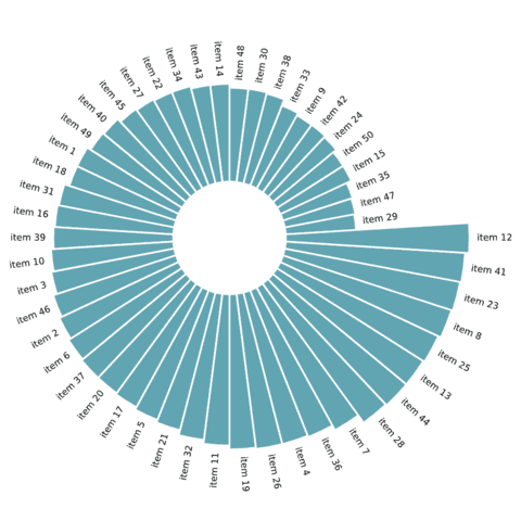
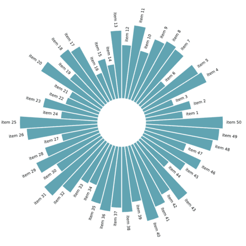
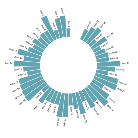
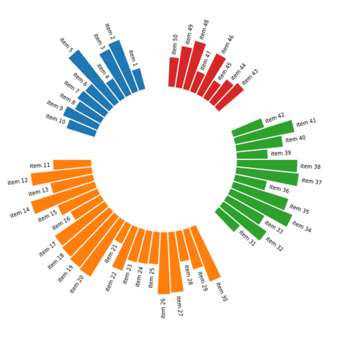
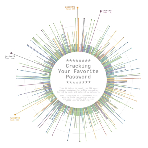
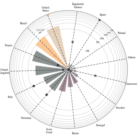
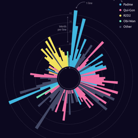
A circular barplot is pretty much the same as a barplot, but using polar coordinates instead of cartesian coordinates. They are a bit tricky to build with Python and less accurate than usual barplot, but they come with an eye-catching effect that sometimes make them worth it.
 Circular barplot with
 Matplotlib
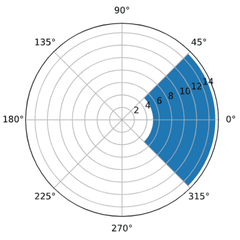
Matplotlib allows to build circular barplots thanks to the polar Layout option of the subplot() function. Examples below should guide you from the most simple version to some more customization.
It starts by explaining how the polar coordinates of matplotlib works, show how to use it to draw bars and finally goes into the trickiness of adding labels.
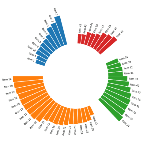
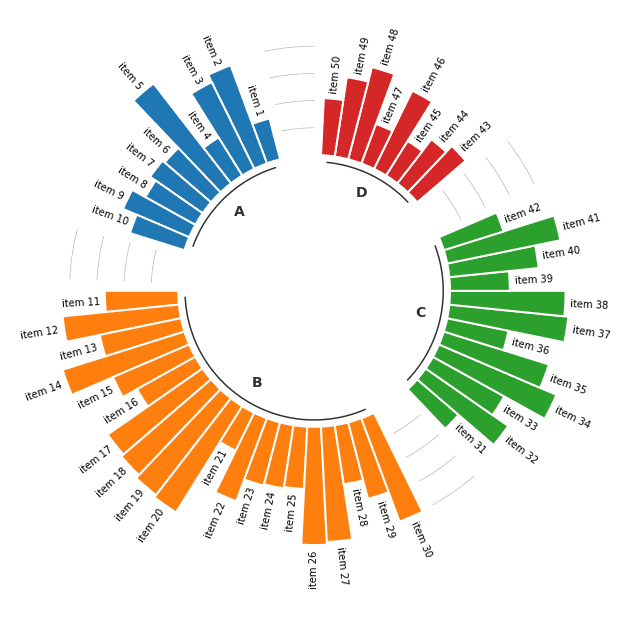
 Grouped Circular barplot
This section extends the previous one by adding a grouping level to the circular barplot. It allows to check for the values of several items split by groups, each item being sorted by value inside its group. It requires quite a bit of matplotlib code but the step-by-step tutorial highlighted below should help go through it.
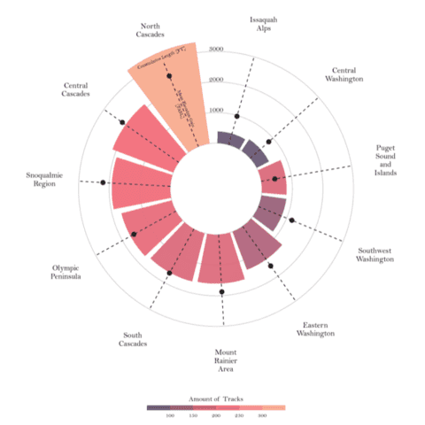
 Best python circular barplot examples
The web is full of astonishing charts made by awesome bloggers, (often using R). The Python graph gallery tries to display (or translate from R) some of the best creations and explain how their source code works. If you want to display your work here, please drop me a word or even better, submit a Pull Request!
🚨 Grab the Data To Viz poster!
Do you know all the chart types? Do you know which one you should pick? I made a decision tree that answers those questions. You can download it for free!

