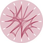
You can use Chord element of holoviews library to produce chord diagrams. It uses bokeh and matplotlib libraries as backends. The following example is taken from the official documentation where you can find more information about the chord element.
# libraries
import pandas as pd
import holoviews as hv
from holoviews import opts, dim
from bokeh.sampledata.les_mis import data

# Should the diagram be plotted with 'bokeh' or 'matplotlib'?
hv.extension('bokeh')
# How large should be the diagram?
hv.output(size=300)

# Data set
nodes = hv.Dataset(pd.DataFrame(data['nodes']), 'index')
links = pd.DataFrame(data['links'])

# Chord diagram
chord = hv.Chord((links, nodes)).select(value=(5, None))
chord.opts(
    opts.Chord(cmap='Category20', edge_cmap='Category20', edge_color=dim('source').str(),
               labels='name', node_color=dim('index').str()))

# Not needed in a jupyter notebook
# It shows the diagram when run in another IDE or from a python script:
from bokeh.plotting import show
show(hv.render(chord))


