Beeswarm

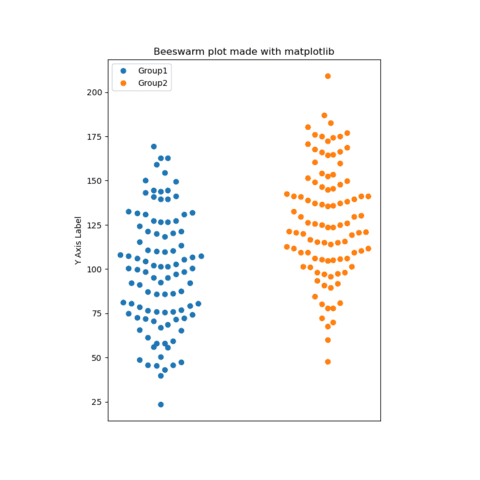
A beeswarm plot or swarmplot is a type of data visualization that displays individual data points in a way that they don't overlap, resulting in a "swarming" effect that resembles a swarm of bees.
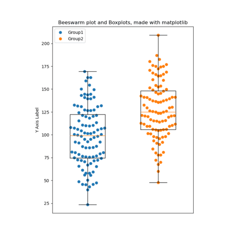
This chart type helps in revealing the distribution of the data along a numeric variable, highlighting the density and variation of the data more effectively than traditional scatter plots or box plots.
This section provides many beeswarm chart examples made with Python, using seaborn or matplotlib. Examples cover the most common use-cases, but also show how far in term of customization it is possible to go.
⏱ Quick start
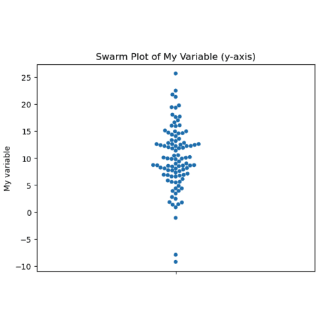
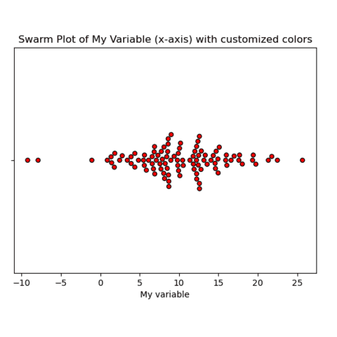
Seaborn comes with a swarmplot() function that is made for beeswarm charts.
It expects a x or a y argument that provides a set of numeric values.
Many options exist. You can check the official documentation or the examples below.
# Libraries
import seaborn as sns
import matplotlib.pyplot as plt
import numpy as np

# Data
my_variable = np.random.normal(loc=10, scale=5, size=100)

# Plot
sns.swarmplot(y=my_variable)
plt.show() # Display the chart
🤔 When to use a beeswarm chart?
The beeswarm chart is a very good alternative to the boxplot that hides the underlying dataset.
However, do not try to use it with a very big dataset. Indeed, avoiding circle overlap will be possible with a small amount of data points, but it will get impossible otherwise. In this case, take a look to the violin chart instead.
To read more about this, visit data-to-viz.com that has a dedicated article.
 Beeswarm with
 Seaborn
Seaborn is a python library allowing to make better charts easily. The swarmplot() function should get you started in minutes. The examples below aim at showcasing the various possibilities this function offers.
🔎 swarmplot() function parameters→ see full doc
→ Description
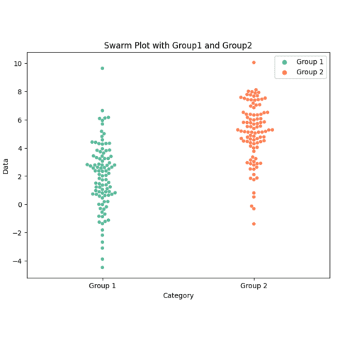
The swarmplot() function from seaborn creates a categorical scatter plot where each point is adjusted (swarmed) so that it does not overlap with others. This plot is particularly useful for visualizing the distribution of data points in small datasets while avoiding data occlusion.
→ Arguments
Description
Variable name that specify which column to plot on the x-axis.
Possible values → string
The simplest usage is to specify a column name (string) of a numerical variable in data. Alternatively, you can omit data and pass a vector-like object of numerical values to x.
Code Example
import seaborn as sns
import matplotlib.pyplot as plt

data = sns.load_dataset("tips")
sns.swarmplot(x="day", y="total_bill", data=data)
plt.show() Beeswarm with
 Matplotlib
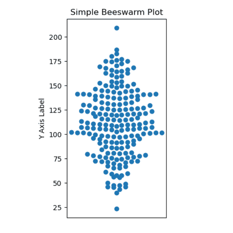
Building a beeswarm plot with matplotlib requires more manual work since no built-in function exists for the job.
The following blog-post explains how to build yours from scratch. The function divides the data into bins, calculates the upper bounds for each bin, and then arranges the data points in each bin to create the horizontal spread in the plot, ensuring they don't overlap.
Once the dot position is available, it is possible to render it usingmatplotlib:
 Best beeswarm examples
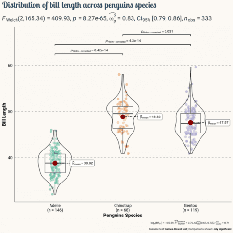
The web is full of astonishing charts made by awesome bloggers, (often using R). The Python graph gallery tries to display (or translate from R) some of the best creations and explain how their source code works. If you want to display your work here, please drop me a word or even better, submit a Pull Request!
🚨 Grab the Data To Viz poster!
Do you know all the chart types? Do you know which one you should pick? I made a decision tree that answers those questions. You can download it for free!

