Libraries
Several libraries are required on top of Python to build such a network chart.
Matplotlib is used for general plotting tasks like setting up the figure dpi and drawing the chart.
NetworkX is the go-to library when it comes to create network diagrams in Python. netgraph is a neat addition to networkX. It aims to complement existing network analysis libraries. You can install them with pip3 install networkx and pip3 install netgraph
Once those 3 libraries are installed, you can import them as follow:
# Import useful libraries
import matplotlib.pyplot as plt
import networkx as nx
from netgraph import Graph
Dataset
This blog post is not based on a real dataset. Instead, I suggest to use some dummy data made using the random_partition_graph() function of the networkX library. You can check how to create a graph object from a pandas data frame in this introduction to networkX.
# Create a modular graph (dummy data)
partition_sizes = [10, 20, 30, 40]
g = nx.random_partition_graph(partition_sizes, 0.5, 0.1)
That's it! We now have an object called g that networkX knows how to read. We are now able to use the Graph function to create some network diagrams.
First network graph
Let's start with a first simple network chart. The Graph function is pretty magical in the sense that it will output something for us using some default parameter. Unfortunately, the output is rather disappointing for now.
%%capture --no-display
# ^ Hide annoying warning for this cell

# Build graph
Graph(g)
<netgraph._main.Graph at 0x12d15cdf0>Apply customization to the network graph
Now, let's use the option of the Graph to get something a bit more good looking.
The first thing we need is to get some color for the nodes based on their community:
# Create a dictionary mapping nodes to their community.
# This information is used position nodes according to their community
# when using the `community` node layout in netgraph.
node_to_community = dict()
node = 0
for community_id, size in enumerate(partition_sizes):
    for _ in range(size):
        node_to_community[node] = community_id
        node += 1

# Color nodes according to their community.
community_to_color = {
    0 : 'tab:blue',
    1 : 'tab:orange',
    2 : 'tab:green',
    3 : 'tab:red',
}
node_color = {node: community_to_color[community_id] \
              for node, community_id in node_to_community.items()}
Now, let's make a good looking network diagram
fig, ax = plt.subplots()
Graph(g,
      node_color=node_color, # indicates the community each belongs to
      node_edge_width=0,     # no black border around nodes
      edge_width=0.1,        # use thin edges, as they carry no information in this visualisation
      edge_alpha=0.5,        # low edge alpha values accentuates bundles as they appear darker than single edges
      node_layout='community', node_layout_kwargs=dict(node_to_community=node_to_community),
      ax=ax,
)
plt.show()
That's already much better!
But one problem remains here. There are a bunch of edges overlapping each other. It makes the figure cluttered and messy. We could definitely bundle the edges together since we know the community each node belongs to.
Network diagram with bundling
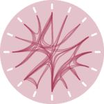
Fortunately, the Graph function has a edge_layout attribute that does exactly this for us. We just need to use the bundled option to bundle the edges together. All the edges from a group will be attracted one to each other, building a much more attractive figure:
# Use the edge_layout option to bundle the edges together
fig, ax = plt.subplots()
Graph(g,
      node_color=node_color,
      node_edge_width=0,
      edge_width=0.1,
      edge_alpha=0.5,
      node_layout='community', node_layout_kwargs=dict(node_to_community=node_to_community),
      edge_layout='bundled', # this is where bundling is made possible
      ax=ax,
)
plt.show()


