Scatterplot

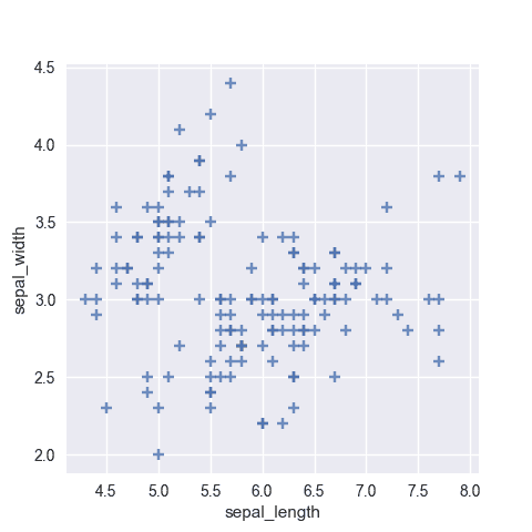
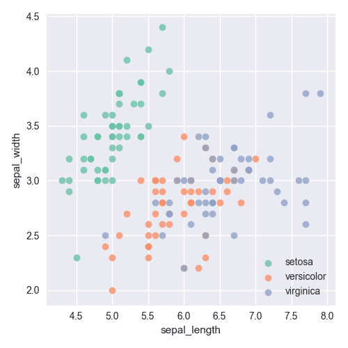
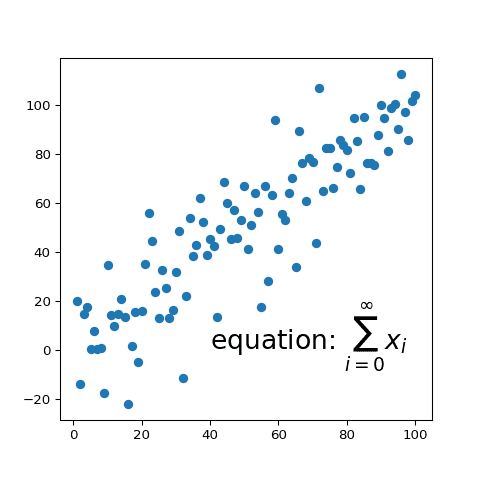
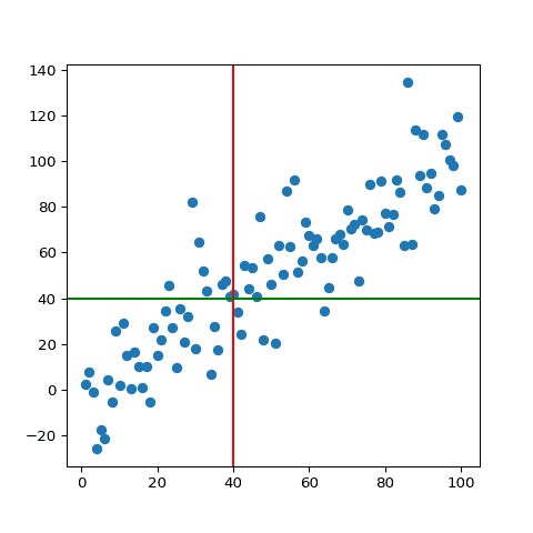
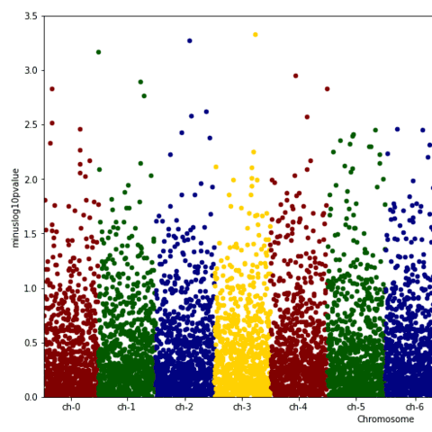
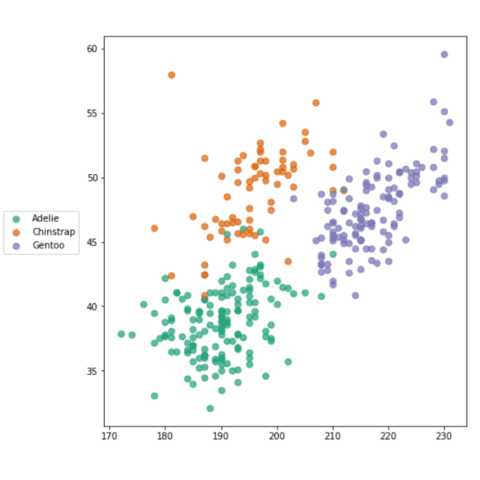
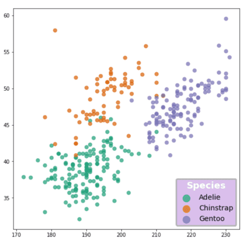
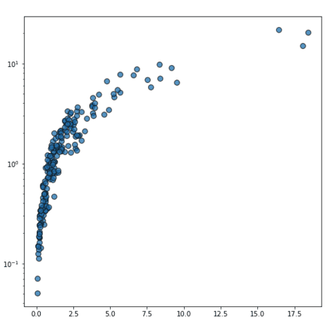
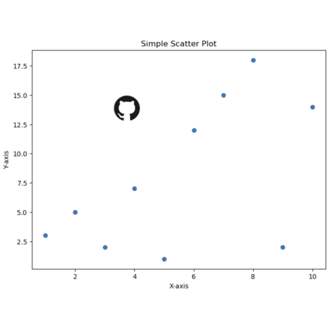
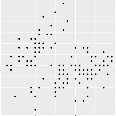
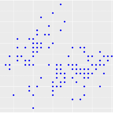
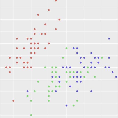
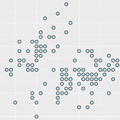
A scatter plot displays the relationship between 2 numeric variables, one being displayed on the X axis (horizontal) and the other on the Y axis (vertical). Each data point is represented as a circle.
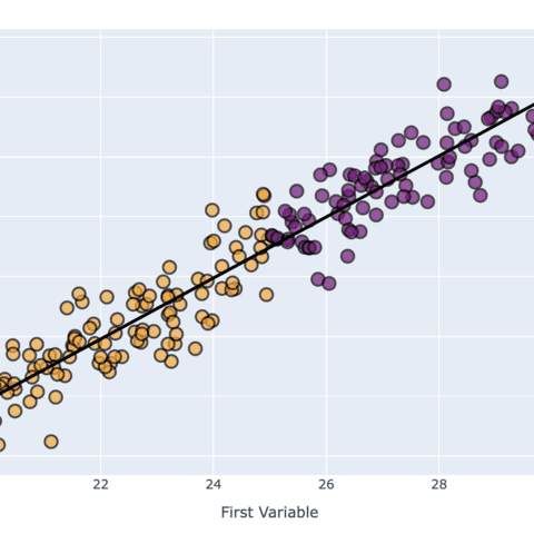
Several tools allow to build scatterplots in python. Seaborn is probably the most straightforward library for the job, but matplotlib allows a greater level of customization. If you are looking for an interactive chart, plotly is definitely the way to go.
This page provides many examples of scatterplots made with those Python tools, going from simple examples to highly customized versions.
⏱ Quick start (Seaborn)
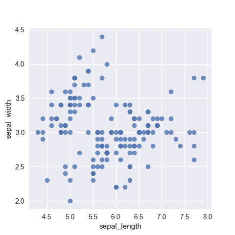
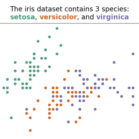
The scatterplot() function of the Seaborn library is definitely the best way to build a scatterplot in seconds. 🔥
Simply pass a numeric column of a data frame to both the x and y variable and the function will handle the rest.
# library & dataset
import seaborn as sns
df = sns.load_dataset('iris')

# use the function scatterplot() to make a scatterplot
sns.scatterplot(x=df["sepal_length"], y=df["sepal_width"])
⚠️ Scatterplot and overplotting
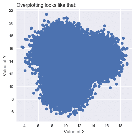
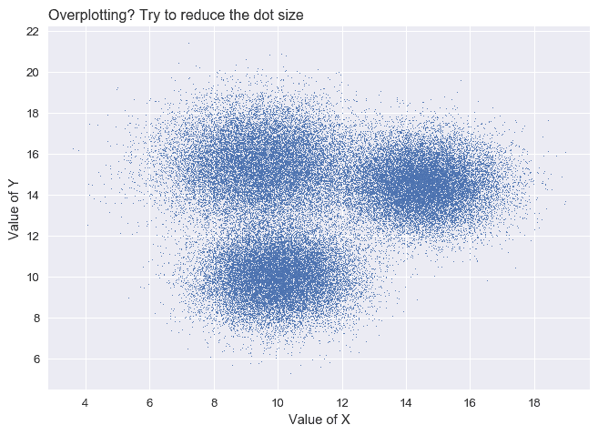
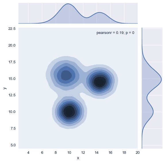
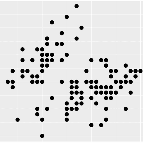
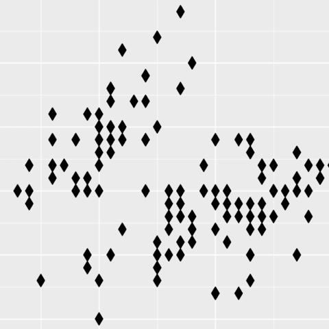
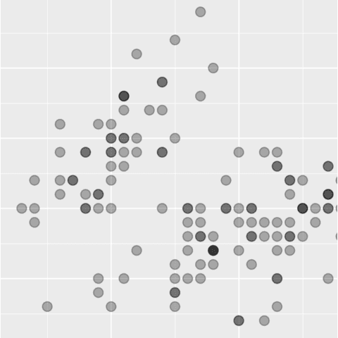
The main danger with scatterplots is overplotting. When the sample size gets big, circles tend to overlap, making the figure unreadable.
Several workarounds exist to fix the issue, like using opacity or switching to another chart type:
 Scatterplots with
 Seaborn
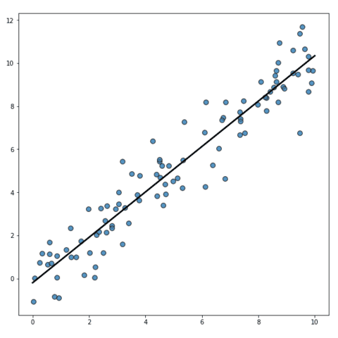
Seaborn is a python library allowing to make better charts easily. The regplot() function should get you started in minutes. The first example below explains how to build the most basic scatterplot with python. Then, several types of customization are described: adding a regression line, tweaking markers and axis, adding labels and more.
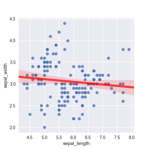
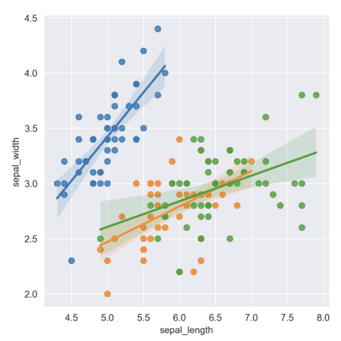
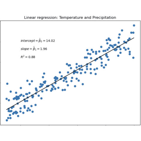
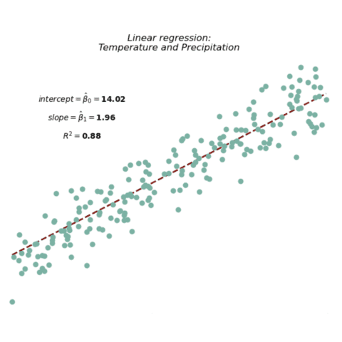
A nice way to add info and highlight trend in a scatter plot is to add a regression line on top of the dots. Thanks to its regplot() and lmplot() function, it's quite easy!
The main difference between those 2 functions are that:
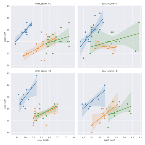
regplot()is used for simple scatter plot with a trend linelmplot()can also be used for facetting: e.g creating multiple scatter plots
🔎 scatterplot() function parameters→ see full doc
→ Description
The scatterplot() function of seaborn creates a scatter plot to visualize the relationship between two continuous variables. It displays each observation as a point on a two-dimensional plane.
→ Arguments
Description
Dataframe-like (pandas, numpy, polars...) with the columns we want to plot.
Possible values → dataframe
It just has to be a pandas.DataFrame (columns are variables),numpy.ndarray (rows/columns are variables), or any mapping/sequence (dictionaries/lists)
Supports both long-form (each variable in its own column) and wide-form (variables in separate columns; reshaped internally).
Code Example
# Library & Dataset
import seaborn as sns
df = sns.load_dataset('iris')

# Plot
sns.scatterplot(
  data=df,
  x='sepal_length',
  y='sepal_width'
)
plt.show()💡 Other charts involving scatterplots and Seaborn
If you are interested in scatterplots, some other chart could be useful to you.
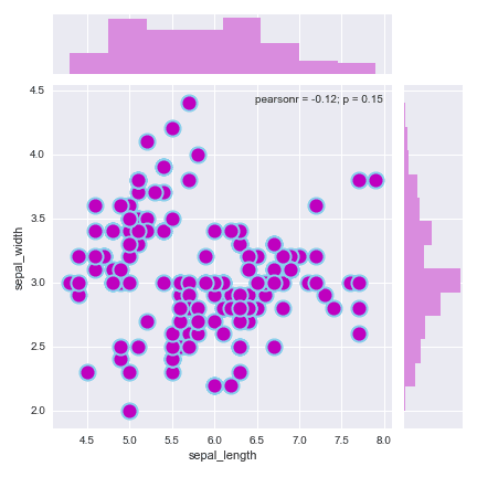
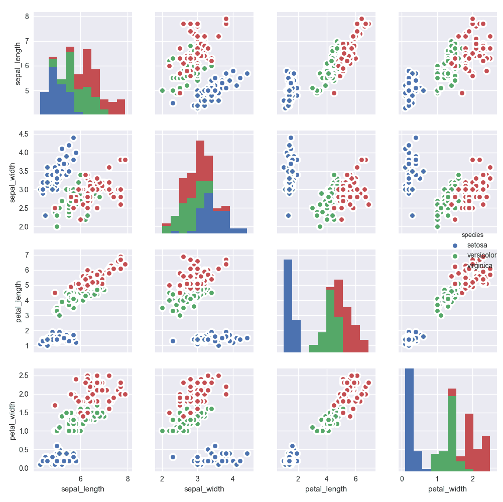
A scatterplot with marginal distribution allows to check the distribution of both the x and y variables. A correlogram allows to check the relationship between each pair of numeric variables in a dataset.
⏱ Quick start (Matplotlib)
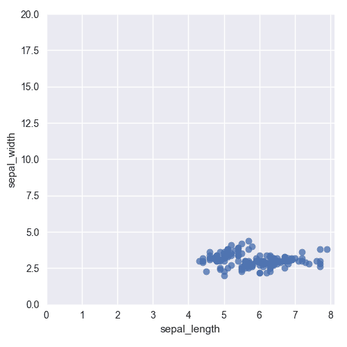
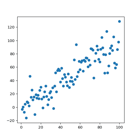
Matplotlib also requires only a few lines of code to draw a scatterplot thanks to its plot() function. The resulting chart is not as good-looking, but the function probably offers more flexibility in term of customization.
# libraries
import matplotlib.pyplot as plt
import numpy as np
import pandas as pd

# Create a dataset:
df=pd.DataFrame({'x_values': range(1,101), 'y_values': np.random.randn(100)*15+range(1,101) })

# plot
plt.plot( 'x_values', 'y_values', data=df, linestyle='none', marker='o')
plt.show()
 Scatterplots with
 Matplotlib
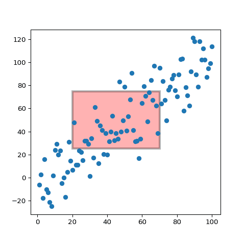
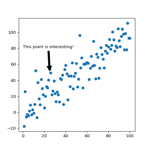
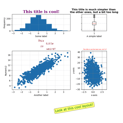
Matplotlib is another great alternative to build scatterplots with python. As often, it takes a bit more lines of code to get a decent chart, but allows more customization.
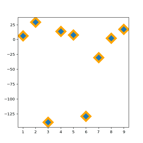
The examples below should get you covered for all the most common problems: adding markers, addinglabels, changing shapes and more.
 Scatterplots with
 Plotly
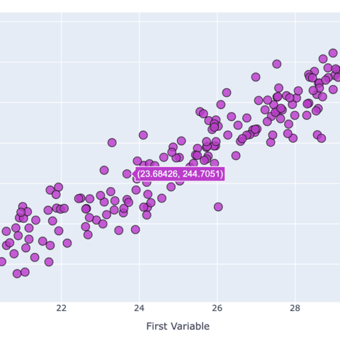
If you are looking for an interactive scatterplot, plotly is definitely the way to go. Try hovering over the graph below!
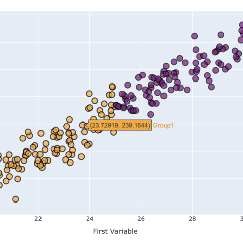
Interactivity is a real plus for scatterplots. It is very useful to have a tooltip associated to every markers to get some additional information about it. Zooming on a specific area of the scatterplot is also very valuable sometimes.
The examples below should help you get started quickly with the plotly API:
 Scatterplots with
 Pandas
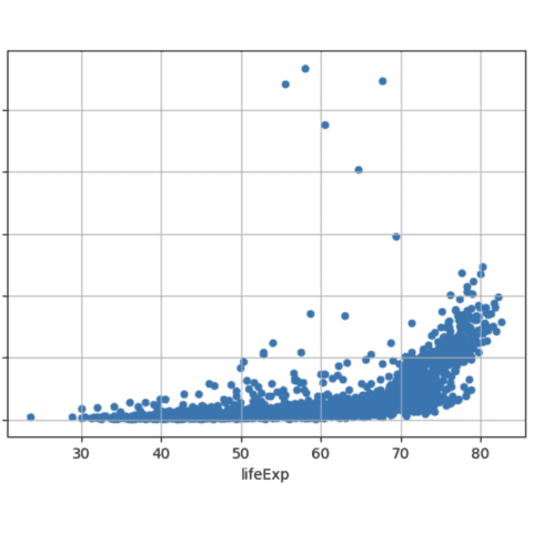
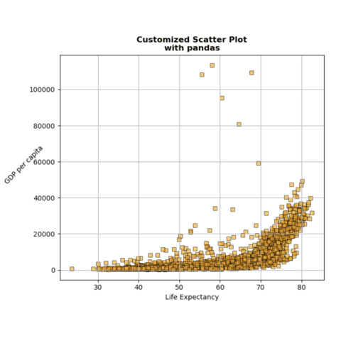
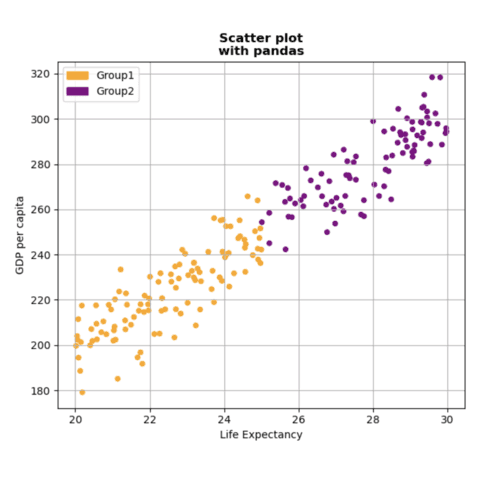
Pandas, a data analysis library, also offers functions to build scatterplots. It uses matplotlib under the hood, but the syntax is more concise.
The main difference is that we have to work with Pandas objects such as Series and DataFrame.
The examples below should help you get started quickly with the pandas API:
 Scatterplots with
 Plotnine
Plotnine is a python library allowing to make charts using the grammar of graphics principles. The geom_point() function should get you started in minutes.
The examples below should help you get started quickly with the plotnine API:
 Best python scatterplot examples
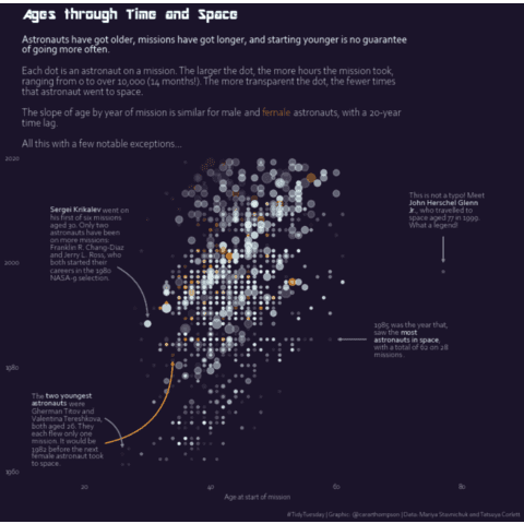
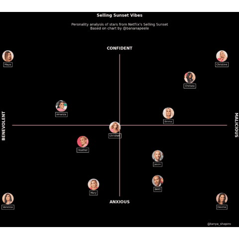
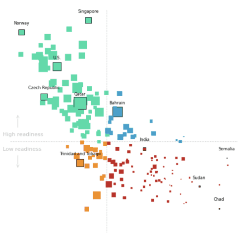
The web is full of astonishing charts made by awesome bloggers, (often using R). The Python graph gallery tries to display (or translate from R) some of the best creations and explain how their source code works.
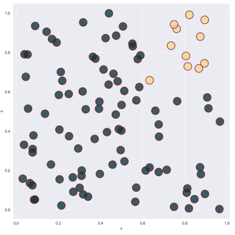
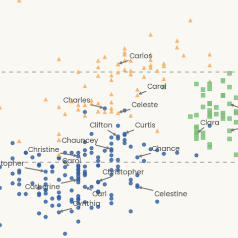
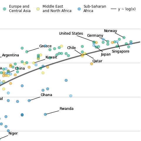
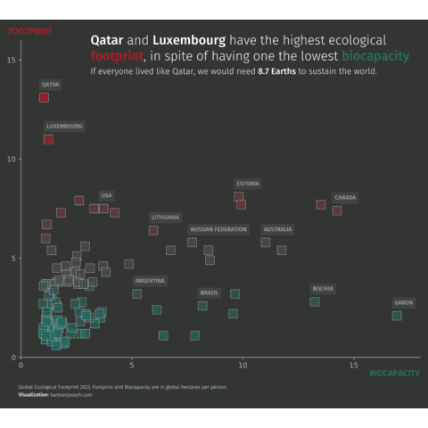
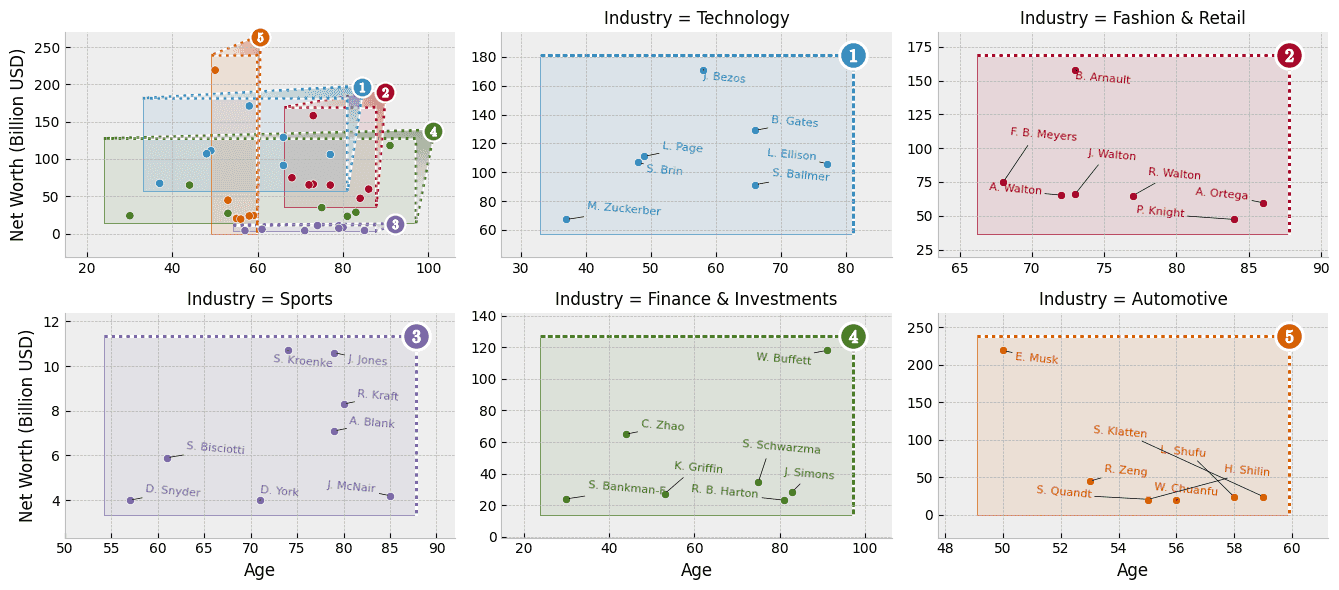
The first example below demos how to add clean labels on a scatterplot, automatically avoiding overlapping. It also explains how to control background, fonts, titles and more.
If you want to display your work here, please drop me a word or even better, submit a Pull Request!
🚨 Grab the Data To Viz poster!
Do you know all the chart types? Do you know which one you should pick? I made a decision tree that answers those questions. You can download it for free!

