Libraries
First, we need to load a few libraries:
- seaborn: for creating the scatterplot
- matplotlib: for displaying the plot
- pandas: for data manipulation
import seaborn as sns
import matplotlib.pyplot as plt
import pandas as pdDataset
Since scatter plot are made for visualizing relationships between two numerical variables, we need a dataset that contains at least two numerical columns.
Here, we will use the iris dataset that we load directly from the gallery:
path = 'https://raw.githubusercontent.com/holtzy/The-Python-Graph-Gallery/master/static/data/iris.csv'
df = pd.read_csv(path)
df.head()| sepal_length | sepal_width | petal_length | petal_width | species | |
|---|---|---|---|---|---|
| 0 | 5.1 | 3.5 | 1.4 | 0.2 | setosa |
| 1 | 4.9 | 3.0 | 1.4 | 0.2 | setosa |
| 2 | 4.7 | 3.2 | 1.3 | 0.2 | setosa |
| 3 | 4.6 | 3.1 | 1.5 | 0.2 | setosa |
| 4 | 5.0 | 3.6 | 1.4 | 0.2 | setosa |
Scatter plot
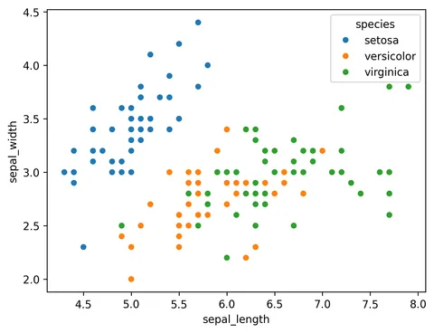
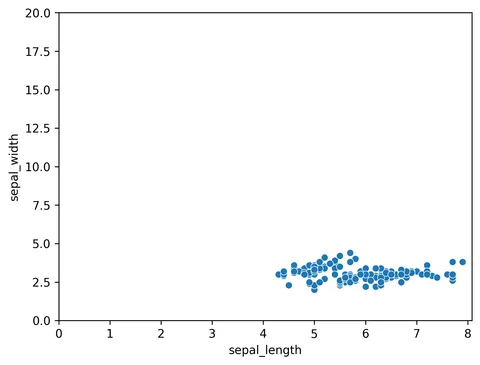
A scatterplot can be made using scatterplot() function of seaborn library. An example dataset from seaborn repository, iris dataset, is used in the example. The plot shows the relationship between sepal lenght and width of plants. In order to show the most basic utilization of this function, the following parameters should be provided:
x: positions of points on the X axisy: positions of points on the Y axis

sns.scatterplot(x=df["sepal_length"], y=df["sepal_width"])
plt.show()Alternatively: you can use the following syntax:

sns.scatterplot(data=df, x="sepal_length", y="sepal_width")
plt.show()Customize the scatter plot
The scatterplot() function accepts the following arguments (among others):
color: of the pointsedgecolor: edge colour of the pointsalpha: transparency of points (between 0 and 1)s: dot size
You can find all the available colors here.

sns.scatterplot(
    x=df["sepal_length"],
    y=df["sepal_width"],
    color="red",
    edgecolor="darkred",
    alpha=0.6,
    s=200
)
plt.show()Going further
This post explains how to create a scatterplot with seaborn.
You might be interested in more advanced examples on