2D Density Chart

This section explains how to build a 2d density chart or a 2d histogram with python. Those chart types allow to visualize the combined distribution of two quantitative variables. They can be build with Matplotlib or Seaborn.
💡 What is a 2D density chart?
There are several chart types allowing to visualize the distribution of a combination of 2 numeric variables. They always have a variable represented on the X axis, the other on the Y axis, like for a scatterplot (left).
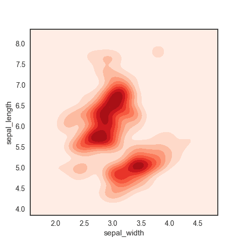
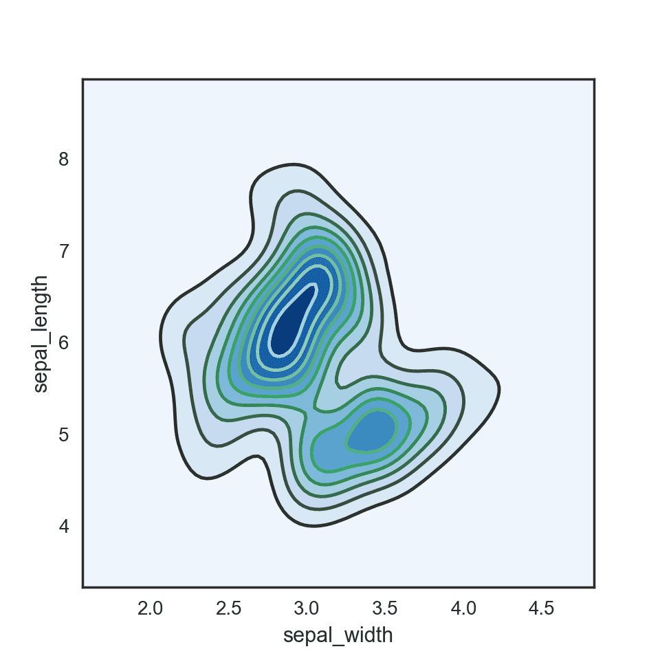
Then the number of observations within a particular area of the 2D space is counted and represented with a color gradient. The shape can vary: hexagones result in a hexbin chart, squares in a 2d histogram. A kernel density estimate can be used to get a 2d density plots or a contour plots
Confusing? Visit data-to-viz to clarify..
 Contour plot with
 Seaborn
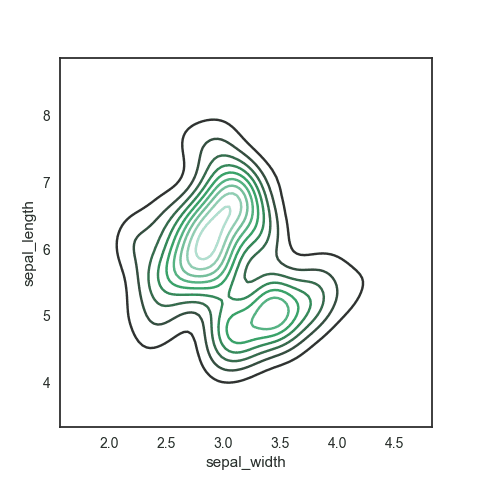
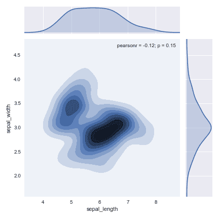
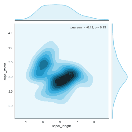
The contour plot can be easily built thanks to the kdeplot() function of the Seaborn library.
 2D histogram with
 Matplotlib
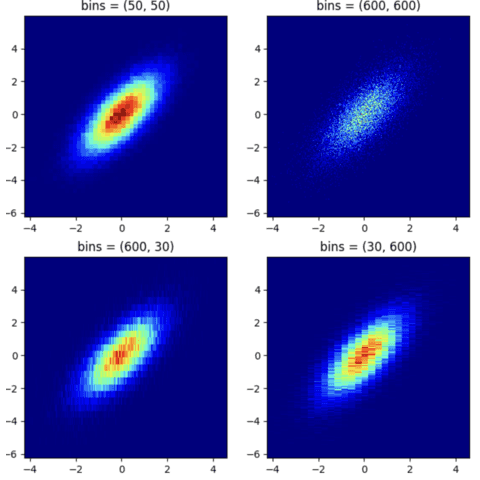
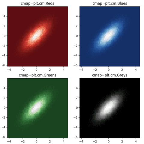
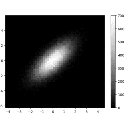
Build a 2d histogram thanks to the hist2d() function of the Matplotlib library. Do not forget to play with the bins argument to find the value representing the best your data.
 Hexbin chart with
 Matplotlib
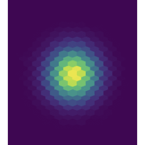
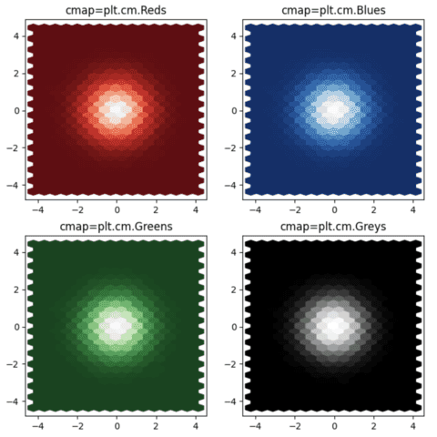
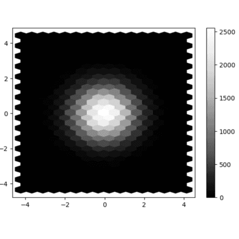
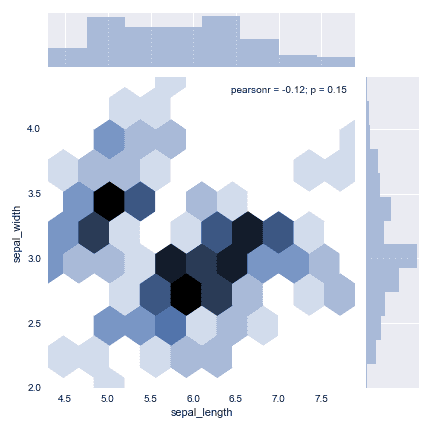
Split the graph area in hexagones and you get a hexbin density chart. This time, it is matplotlib that gets you covered thanks to its hexbin() function.
 2d density chart with
 Matplotlib
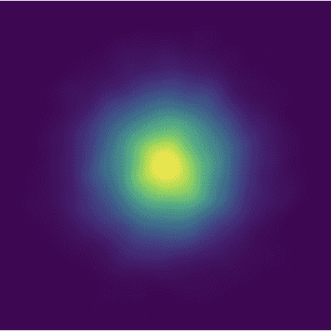
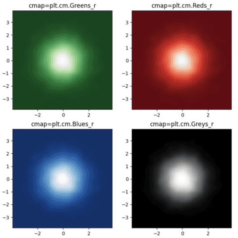
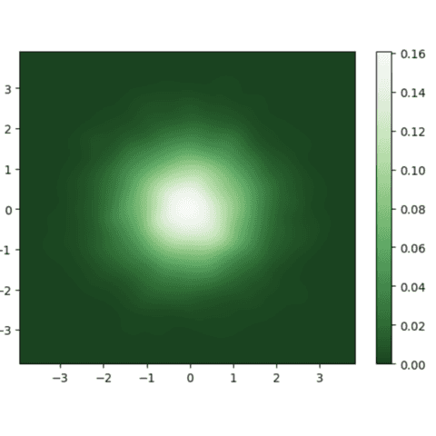
2D densities are computed thanks to the gaussian_kde() function and plotted thanks with the pcolormesh() function of matplotlib().
 2d density and marginal plots
2D densities often combined with marginal distributions. It helps to highlight the distribution of both variables individually. It is pretty straightforward to add thanks to the jointplot() function of the Seaborn library.
🚨 Grab the Data To Viz poster!
Do you know all the chart types? Do you know which one you should pick? I made a decision tree that answers those questions. You can download it for free!


