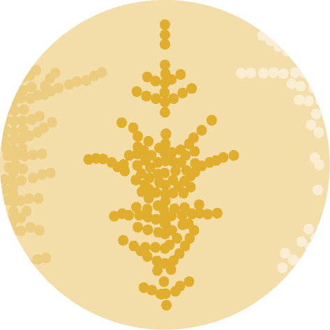
Beeswarm definition
Imagine you want to know how your friends' height is distributed.
To do this, you can use a swarm plot, which is a visual way of seeing individual data points (in this case, the height of your friends) and how they are distributed.
Circles are slightly shifted to avoid overlaps. It ends up in a neat organic shape that is visually attracting and avoids to hide information. It allows you to quickly understand the extent and distribution of data without losing any information.
You can read more about beeswarm in the dedicated section of the gallery.
Libraries
First, you need to install the following librairies:
- seaborn is used for creating the chart witht the
swarmplot()function - matplotlib is used for plot customization purposes
numpyis used to generate some data
Don't forget to install seaborn if you haven't already done so with the pip install seaborn command.
# Libraries
import seaborn as sns
import matplotlib.pyplot as plt
import numpy as np

plt.rcParams["figure.dpi"] = 300
Dataset
Since beeswarm plots are meant to represent continuous variables, let's generate a sample of 100 randomly distributed observations using numpy and its random.normal() function. Our sample is generated with a mean of 10 and a standard deviation of 5.
my_variable = np.random.normal(loc=10, scale=5, size=1000)Basic beeswarm plot
The following code displays a simple bee swarm graphic, with a title and an axis name, thanks to the swarmplot() function.
Note that circles are displayed vertically since the numeric vector is passed to the y axis.
That's it! A first beeswarm plot made with the default parameters.
fig, ax = plt.subplots(figsize=(10, 10))

sns.swarmplot(y=my_variable, ax=ax)

plt.show()
Color and orientation
Modify the colors
The following code uses the color, edgecolor and linewidth arguments to modify the style of points.
colordefines the point coloredgecolordefines the color of the edge colorlinewidthdefines the the edge size. The edgecolor will not appear if you don't explicit the latter argument since its default value is 0.
Use another orientation
If you want to show your variable distribution on a given axis, you just have to put x=my_variable for the x-axis or y=my_variable for the y-axis. It's that simple, allowing to switch from a horizontal to a vertical beeswarm chart.
fig, ax = plt.subplots(figsize=(10, 10))

sns.swarmplot(
    x=my_variable,
    ax=ax,
    color="red",  # Point color
    edgecolor="black",  # Edge color
    linewidth=0.9,  # Edge size
)
plt.show()
Beeswarm with multiple groups
Dataset
First, we need to create data with 2 groups. To do this, we take the following steps:
- Define the sample size per group. Given that we have two groups, there will be 100 people in each, for a total of 200.
- Create the data for each group (here, we give them a different mean with
loc=0VSloc=2, in order to have sufficiently different groups) - Create the list containing the group name for each observation
sample_size = 500  # Define the size of the random data samples.

data_group1 = np.random.normal(
    loc=2, scale=2, size=sample_size
)  # Generate data points for 'Group 1'
data_group2 = np.random.normal(
    loc=5, scale=2, size=sample_size
)  # Generate data points for 'Group 2'
data_combined = np.concatenate(
    [data_group1, data_group2]
)  # Concatenate the data to create a combined dataset

category_feature = ["Group 1"] * sample_size + [
    "Group 2"
] * sample_size  # List that indicates the category for each data point
Plot
This time, both the x and y attributes must be provided. Also, it is common to use a categorical color sheme to color groups thanks to the palette argument to color groups.
fig, ax = plt.subplots(figsize=(10, 10))

sns.swarmplot(
    x=category_feature,  # Group labels
    ax=ax,
    y=data_combined,  # Numeric variable
    palette="Set2",  # Color set used
    hue=category_feature,  # Add a legend
)

plt.xlabel("Category")
plt.ylabel("Data")
plt.show()
Customize palette
Thanks to the pypalettes library, it's super easy to use a large number of palette in your seaborn/matplotlib charts. You can find your dream palette in the color palette finder, and use the load_cmap() function with the name of the palette you want. Here is an example with the classic palette:
from pypalettes import load_palette

fig, ax = plt.subplots(figsize=(10, 10))

# load a palette
palette = load_palette("classic")

sns.swarmplot(
    x=category_feature,  # Group labels
    ax=ax,
    y=data_combined,  # Numeric variable
    palette=palette,  # Color set used
    hue=category_feature,  # Add a legend
    size=7,
)

plt.xlabel("Category")
plt.ylabel("Data")
plt.show()
Going further
That's it for a quick introduction to beeswarm plot with seaborn.
Please check the beeswarm section of the gallery to see many more examples with higher levels of customization.


