Violin plot

A violin plot allows you to visualize the distribution of a numeric variable for one or several groups. Seaborn is particularly adapted to build it thanks to its violin() function. Violin plots deserve more attention than boxplots, which can sometimes hide features of the data.
⏱ Quick start
Seaborn is definitely the best library to quickly build a violin plot. It offers a dedicated violinplot() function that roughly works as follows:🔥

# library & dataset
import seaborn as sns
df = sns.load_dataset('iris')

# plot
sns.violinplot(x=df["species"], y=df["sepal_length"]) Violin charts with
 Seaborn
Seaborn is a python library that enables you to make better visualizations. It is well adapted to build density charts thanks to its violin function. The following charts will guide you through its usage, going from a very basic violin plot to something much more customized.

How to build a very basic violin. Shows example based on different input formats.

Make your violin chart horizontal to make labels more readable

Chart appearance: control violin width, stroke width and more

How to manage colors on a python violin plot

Control the groups order, very useful if you want to display them by increasing mean

If you have both groups and subgroups, you'll be interested in a grouped violin plot

Split subgroups on the same axis

Show the number of observations per group

Add a swarmplot on top of a violin chart to show individual data points
🔎 violinplot() function parameters → see full doc
→ Description
The violinplot() function of seaborn creates violin plots which show the distribution of quantitative data across several levels of one (or more) categorical variables. It combines a box plot with a kernel density estimation.
→ Arguments
Description
Inputs for plotting long-form data. This parameter specify the variable for the x axes.
Possible values → string, vector, or pd.Series
Can be vector names in the data DataFrame, or external vectors passed directly.
Code Example
# Library & Dataset
import seaborn as sns
import matplotlib.pyplot as plt
tips = sns.load_dataset("tips")

# Plot
sns.violinplot(x="total_bill", data=tips)
plt.show()
 Violin charts with
 Matplotlib
Matplotlib, as usual, is another great otion to build violin charts with python. It comes with a violinplot() function that does all the hard work for us.
Here are a couple of examples:


Best python violin chart examples
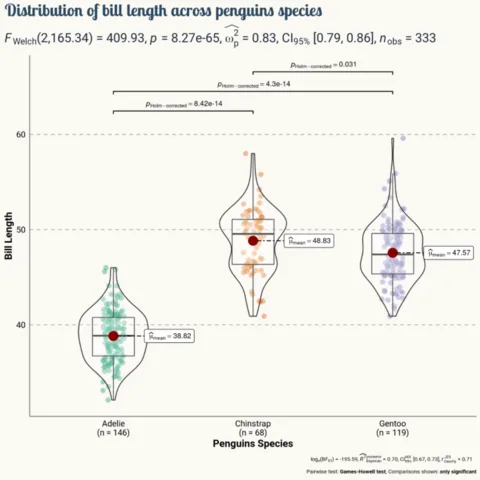
The web is full of astonishing charts made by awesome bloggers, (often using R). The Python graph gallery tries to display (or translate from R) some of the best creations and explain how their source code works. If you want to display your work here, please drop me a word or even better, submit a Pull Request!




💡 Out of dataviz inspiration?
I have spent years collecting the most beautiful data visualizations out there. Get the list of my top 300 dataviz projects, hand-picked, for free.
I respect your privacy. Unsubscribe anytime.