Boxplot

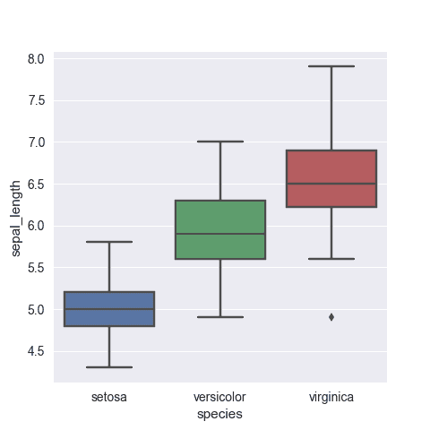
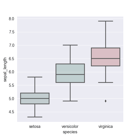
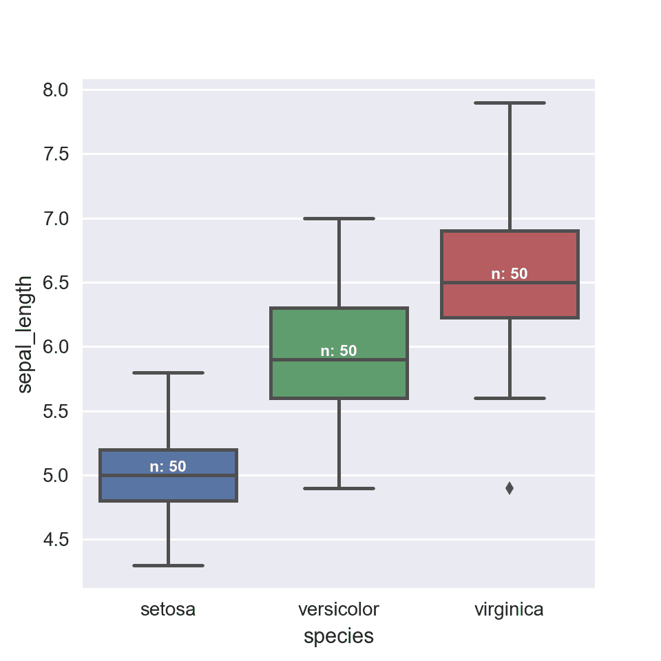
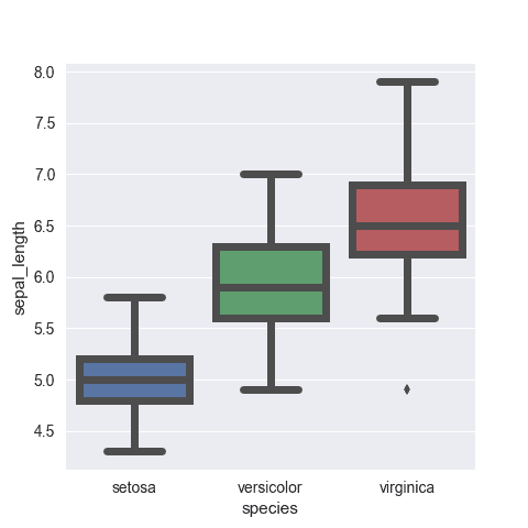
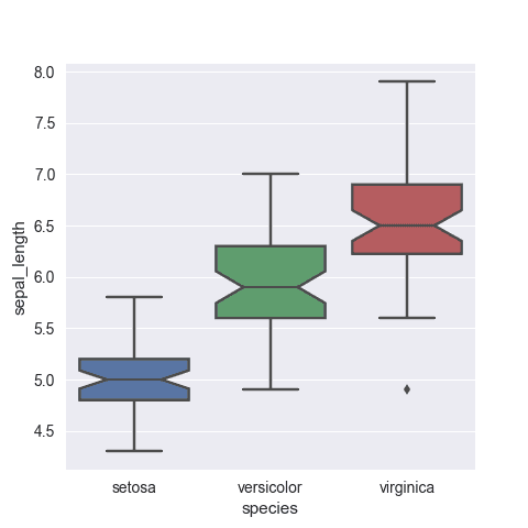
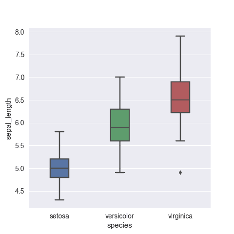
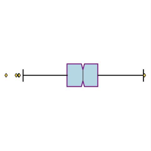
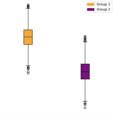
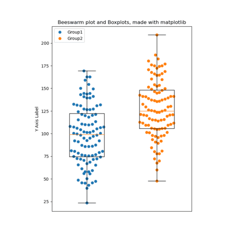
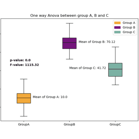
A boxplot summarizes the distribution of a numeric variable for one or several groups. It allows to quickly get the median, quartiles and outliers but also hides the dataset individual data points.
In python, boxplots can be made with both seaborn and matplotlib as they both offer a boxplot() function made for the job.
⏱ Quick start
Seaborn is definitely the best library to quickly build a boxplot. It offers a dedicated boxplot() function that roughly works as follows:🔥
# library & dataset
import seaborn as sns
df = sns.load_dataset('iris')

sns.boxplot( x=df["species"], y=df["sepal_length"] )
⚠️ Mind the boxplot
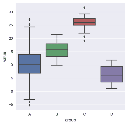
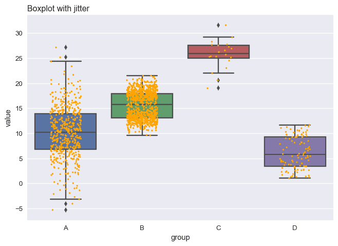
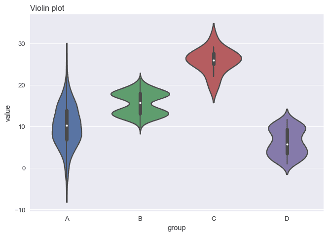
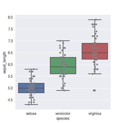
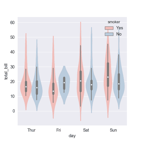
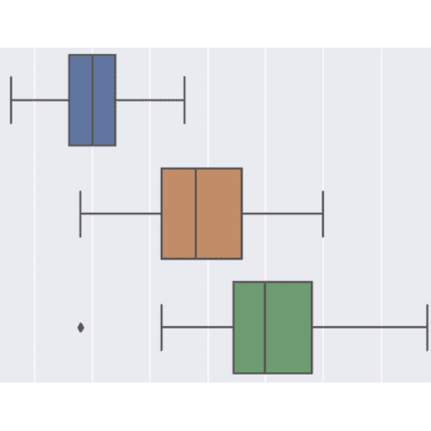
A boxplot is an awesome way to summarize the distribution of a variable. However it hides the real distribution and the sample size. Check the 3 charts below that are based on the exact same dataset.
To read more about this, visit data-to-viz.com that has a dedicated article.
 Boxplots with
 Seaborn
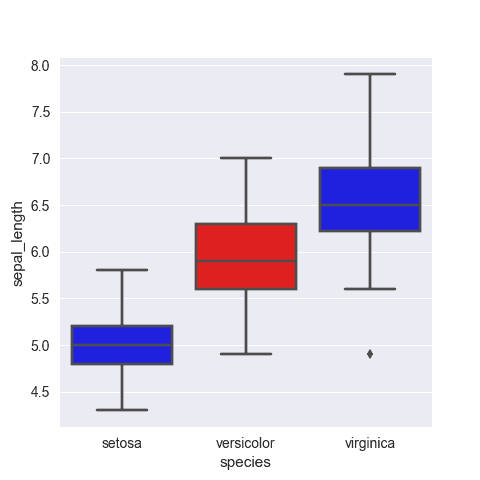
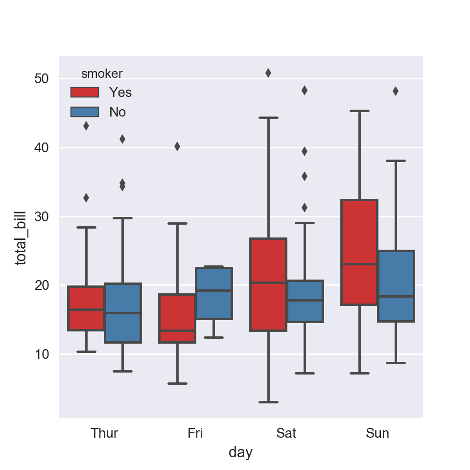
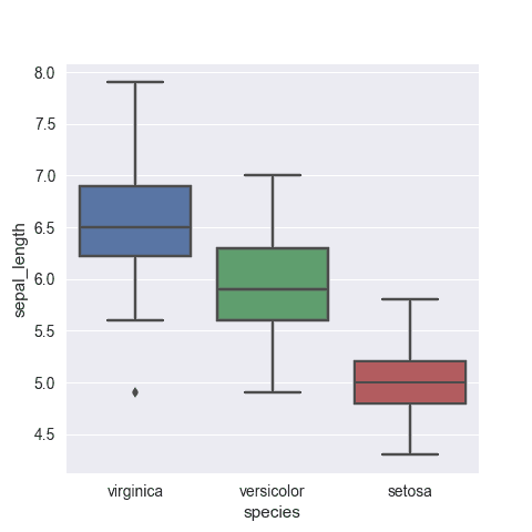
Seaborn is a python library allowing to make better charts easily. The boxplot function should get you started in minutes. The examples below aim at showcasing the various possibilities this function offers.
 Boxplots with
 Matplotlib
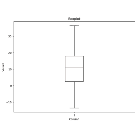
Matplotlib also has a boxplot() function made to build boxplots.
The following tutorials will guide you from its basic usage to the finest customization:
 Best python boxplot examples
The web is full of astonishing charts made by awesome bloggers, (often using R). The Python graph gallery tries to display (or translate from R) some of the best creations and explain how their source code works. If you want to display your work here, please drop me a word or even better, submit a Pull Request!
🚨 Grab the Data To Viz poster!
Do you know all the chart types? Do you know which one you should pick? I made a decision tree that answers those questions. You can download it for free!

