

About population pyramid chart?
What is it?
A population pyramid chart is like a graph that shows how many people of different ages and genders live in a certain place. It's like looking at the ages and whether they're boys or girls, men or women, all at once.
Imagine you're looking at a mountain with two sides: one side is for boys or men, and the other side is for girls or women. If the mountain is wide at the bottom, it means there are lots of young people. If it's wide at the top, it means there are more old people. The shape of the mountain can tell us if a place has more young people, more old people, or an equal number of all ages.
Reproduction
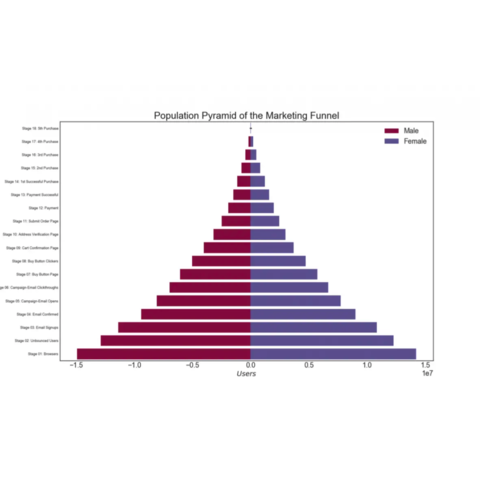
In this post, we will reproduce a chart from Machine Learning Plus. In this case, the population pyramid is used to show the stage-by-stage filtering of the population as it is used below to show how many people pass through each stage of a marketing funnel.
Let's see what the final picture will look like:
Libraries
First, you need to install the following librairies:
- matplotlib is used for creating the chart and for customization
pandasis used to put the data into a dataframeseabornwill be used for itsbarplot()function.
# Libraries
import matplotlib.pyplot as plt
import seaborn as sns
import pandas as pd
Dataset
The dataset used can be obtained using the url below and then opened using the read_csv() function in pandas.
url = "https://raw.githubusercontent.com/holtzy/the-python-graph-gallery/master/static/data/email_campaign_funnel.csv"

# Original url (to be used in case the above one does not work)
url = "https://raw.githubusercontent.com/selva86/datasets/master/email_campaign_funnel.csv"
df = pd.read_csv(url)
Reproducing the chart
This code creates a barplot that represents the progression of different gender groups through various stages of a marketing funnel. Each bar corresponds to a specific stage, and the color of the bars indicates the gender distribution at each stage.
# Create a figure and axis with a specific size
fig, ax = plt.subplots(figsize=(4, 8))

# Define the column in the dataframe that represents the groups/categories
group_col = 'Gender'

# Determine the order of bars on the y-axis by unique values in the 'Stage' column and reversing the order
order_of_bars = df.Stage.unique()[::-1]

# Generate a list of colors for each group, using the Spectral colormap
colors = [plt.cm.Spectral(i / float(len(df[group_col].unique()) - 1)) for i in range(len(df[group_col].unique()))]

# Iterate through each group and plot a bar for each stage within that group
for color, group in zip(colors, df[group_col].unique()):

    # Create a bar plot using Seaborn's barplot function
    sns.barplot(x='Users',  # Data for the width of bars
                y='Stage',  # Data for the y-axis (stages of purchase)
                data=df.loc[df[group_col] == group, :],  # Filter data for the current group
                order=order_of_bars,  # Specify the order of stages on the y-axis
                color=color,  # Assign a color to the bar
                label=group,  # Assign a label for the plot legend
                ax=ax,  # Specify the axis to plot on (previously created)
               )

# Set labels and title for the axes
ax.set_xlabel("Users")  # X-axis label
ax.set_ylabel("Stage of Purchase")  # Y-axis label
ax.set_title("Population Pyramid of the Marketing Funnel", fontsize=22) # Plot title

# Display the legend, which shows labels for the groups
ax.legend()

# Display the plot
plt.show()
Going further
This article explains how to reproduce the pyramid plot from this article on machinelearningplus.com (the 29th).
For more examples of how to create or customize your barplots with Python, see the barplot section. You may also be interested in creating a barplot with the number of observations.


