

Libraries
First, you need to install the following librairies:
- matplotlib is used for creating the chart and add customization features
- pandas is used to put the data into a dataframe
highlight_textis used to add custom annotations to the chart
Install it with pip install highlight_text
And that's it!
# Libraries
import pandas as pd
import matplotlib.pyplot as plt
import matplotlib.patches as patches  # for the arrows

from highlight_text import ax_text, fig_text
Dataset
For this reproduction, we're going to retrieve the data directly from the gallery's Github repo. This means we just need to give the right url as an argument to pandas' read_csv() function to retrieve the data.
# Open the dataset from Github
url = "https://raw.githubusercontent.com/holtzy/the-python-graph-gallery/master/static/data/fiscal_sponsor_directory.csv"
df = pd.read_csv(url)
Our goal is to semi-automaticaly detect the main topic of each fiscal sponsor. After a bit of manual work, we can use the project_types column to create a project column with a reduced number of categories.
Then, we sort the data by the number of fiscal sponsorships and keep the top 15. We also compute a few statistics for the annotations at the end.
def cleanProjectTypes(text):
    text = str(text)
    text = text.lower()

    # get all content before |
    text = text.split('|')[0]

    if text[:5] == 'other':
        text = text[:5]

    elif 'arts and culture' in text:
        text = 'arts and culture'

    elif 'disaster relief' in text:
        text = text[:15]

    elif text[:15] == 'case management':
        text = 'health'

    elif 'economic development' in text:
        text = 'economic development'

    elif 'environment' in text:
        text = 'environment'

    elif 'ethnographic' in text:
        text = 'arts and culture'

    elif 'health' in text:
        text = 'health'

    elif 'social justice' in text:
        text = 'social justice'

    elif 'education' in text or 'youth' in text or 'child' in text:
        text = 'education'

    return text[0].upper() + text[1:]


# create the dataframe for the plot
n_topic = 15
best_contrib = df[['name', 'n_sponsored', 'project_types']].sort_values(by='n_sponsored', ascending=False)
best_contrib['project'] = best_contrib['project_types'].apply(cleanProjectTypes)
best_contrib.sort_values(by='n_sponsored', ascending=False, inplace=True)

# other stats
religion = best_contrib[best_contrib['project'] == 'Faith-based/religious']['n_sponsored'].sum()
religionPart = religion / best_contrib['n_sponsored'].sum() * 100

NHF = best_contrib[best_contrib['name'] == 'New Horizons Foundation Inc']['n_sponsored'].sum()
NHFPart = NHF / best_contrib[best_contrib['project_types'] == 'Faith-based/religious']['n_sponsored'].sum() * 100

art = best_contrib[best_contrib['project'] == 'Arts and culture']['n_sponsored'].sum()
artPart = art / best_contrib['n_sponsored'].sum() * 100

best_contrib = best_contrib.head(n_topic)
best_contrib.sort_values(by='n_sponsored', ascending=True, inplace=True)
Basic barplot
Let's start with a simple version of the plot that uses the barh() function to create the barplot
# initialize the figure
fig, ax = plt.subplots(figsize=(6,8))

# create the plot
ax.barh(best_contrib['name'], best_contrib['n_sponsored'], color='skyblue')

# display the plot
plt.show()
Custom axis and first annotations
In this step, we add a few customizations to the plot:
- remove the axis with the
axis('off')function - shift sponsors' names so that they are inside the bars
- add the number of fiscal sponsorships on the right of the bars
We mainly use the ax.text() function to add the annotations, where the positions are determined by the number of fiscal sponsorships.
# initialize the figure
fig, ax = plt.subplots(figsize=(8, 10))

# remove axis
ax.axis('off')

# create the plot
ax.barh(best_contrib['name'], best_contrib['n_sponsored'])
for i, (value, name) in enumerate(zip(best_contrib['n_sponsored'],
                                      best_contrib['name'])):
    if name.startswith('The Hektoen Institute'):
        name = 'The Hektoen Institute'
    elif name.startswith('From the Heart'):
        name = 'FHP'
    elif name.startswith('The Gotham Film'):
        name = 'GF&M Institute'
    ax.text(x=1, y=i, s=f' {name}',
            ha='left', va='center', fontsize=10)
    ax.text(x=value, y=i, s=f' {int(value)}',
            ha='left', va='center', fontsize=10)

# display the plot
plt.show()
Custom colors
Ideally, each bar would have a color according to the project column. We can use the c argument of the barh() function to do that.
But before we create a color map, we need to create a dictionary that maps each project to a color.
We'll also change the main theme of the chart to a dark one. For this, we use:
- the
set_facecolor()function to change the background color
# initialize the figure
fig, ax = plt.subplots(figsize=(8, 10))

# remove axis
ax.axis('off')

# colors for the plot
colors = {
    'Arts and culture': '#f792ad',
    'Health': '#3fd975',
    'Environment': '#43f79a',
    'Bill paying': '#bd112b',
    'Other': 'lightgrey',
    'Faith-based/religious': '#b1f0e0',
}
c = [colors[category] for category in best_contrib['project']]
background_color = 'black'
fig.set_facecolor(background_color)
ax.set_facecolor(background_color)
text_color = 'white'

# create the plot
ax.barh(best_contrib['name'], best_contrib['n_sponsored'], color=c)
for i, (value, name) in enumerate(zip(best_contrib['n_sponsored'],
                                      best_contrib['name'])):
    if name.startswith('The Hektoen Institute'):
        name = 'The Hektoen Institute'
    elif name.startswith('From the Heart'):
        name = 'FHP'
    elif name.startswith('The Gotham Film'):
        name = 'GF&M Institute'
    ax.text(x=1, y=i, s=f' {name}',
            ha='left', va='center', fontsize=10, color='black')
    ax.text(x=value, y=i, s=f' {int(value)}',
            ha='left', va='center', fontsize=10, color=text_color)

# display the plot
plt.show()
Annotations
Now the last things missing are the arrows and the annotations. This is not the funniest part but it the part that will make the chart really stand out.
Add a title
The title is added with the text() function and not the title() function because it gives us more customization options.
Add a credit
For the credit, we need the highlight_text package that makes way easier customizing annotations! We use the fig_text() function, which is similar to fig.text() but with more customization options.
Add arrows
We will create a custom arrow in Matplotlib by defining its style, size, and color, and then positions it on the figure using specified tail and head coordinates. It uses a FancyArrowPatch for flexible styling, including an arc connection style, and adds this arrow to the current plot's axes. This approach allows for detailed customization and highlighting within visual presentations, making it ideal for annotating or drawing attention to specific areas of a plot.
# initialize the figure
fig, ax = plt.subplots(figsize=(14, 15))
# remove axis
ax.axis('off')
# colors for the plot
colors = {
'Arts and culture': '#e07a5f',
'Health': '#f4f1de',
'Bill paying': '#f2cc8f',
'Other': 'lightgrey',
'Faith-based/religious': '#81b29a',
}
c = [colors[category] for category in best_contrib['project']]
background_color = '#171717'
fig.set_facecolor(background_color)
ax.set_facecolor(background_color)
text_color = 'white'
# create the plot
ax.barh(best_contrib['name'], best_contrib['n_sponsored'], color=c)
for i, (value, name) in enumerate(zip(best_contrib['n_sponsored'],
best_contrib['name'])):
if name.startswith('The Hektoen Institute'):
name = 'The Hektoen Institute'
elif name.startswith('From the Heart'):
name = 'FHP'
elif name.startswith('The Gotham Film'):
name = 'GF&M Institute'
ax.text(x=10, y=i, s=f' {name}',
ha='left', va='center', fontsize=12, color='black')
ax.text(x=value, y=i, s=f' {int(value)}',
ha='left', va='center', fontsize=12, color=text_color)
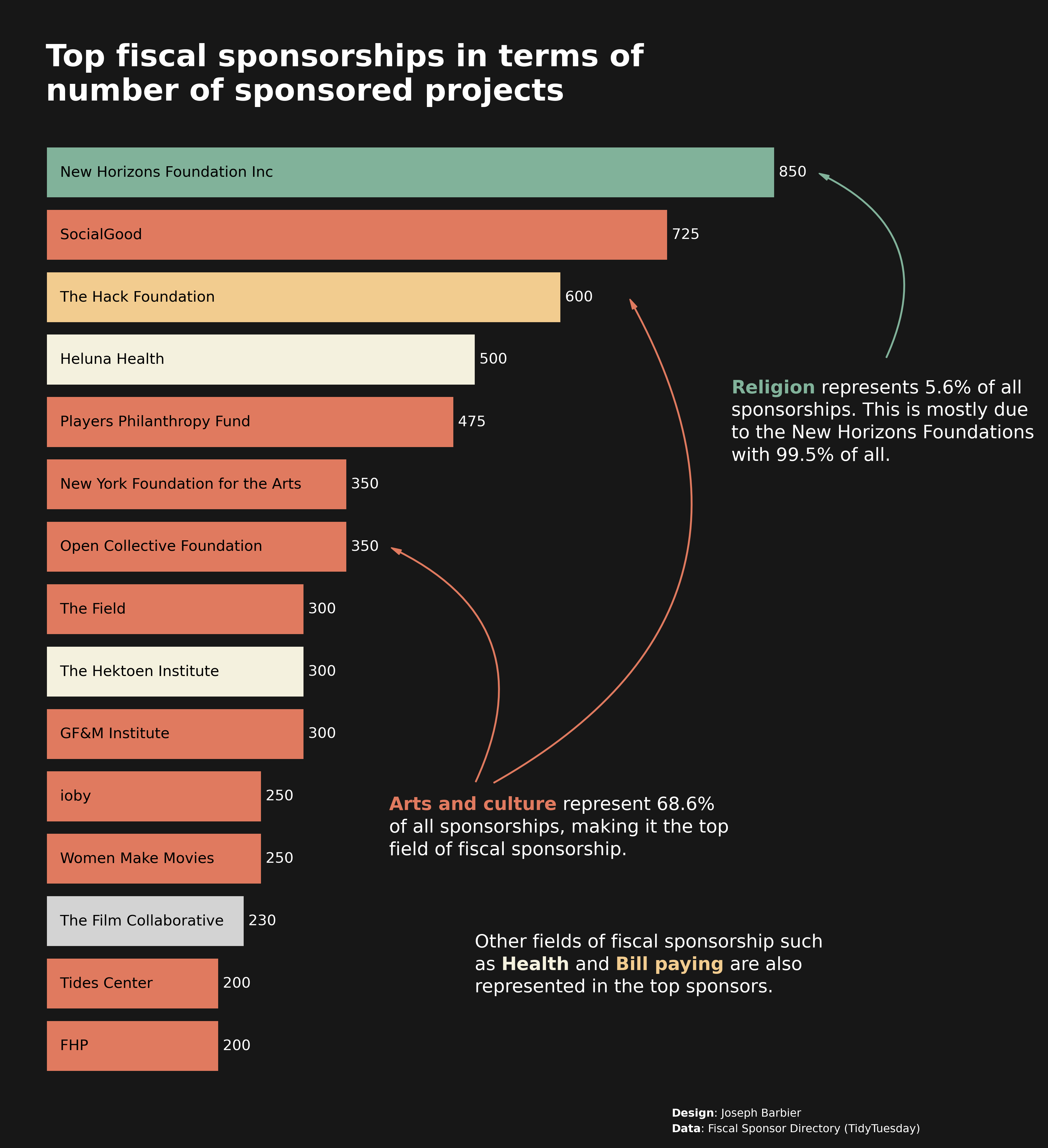
# add a title
text = """
Top fiscal sponsorships in terms of
number of sponsored projects
"""
fig.text(x=0.155, y=0.9,
s=text,
fontsize=25, ha='left', va='center',
weight='bold', color=text_color
)
# credits
text = "<Design>: Joseph Barbier\n<Data>: Fiscal Sponsor Directory (TidyTuesday)"
ax_text(x = 730, y = -1,
s=text,
color=text_color,
fontsize=9,
highlight_textprops=[{"fontweight": 'bold'},
{"fontweight": 'bold'}],
ax=ax)
# arts annotation
text = "<Arts and culture> represent "
text += str(round(artPart,1))
text += "%\nof all sponsorships, making it the top\n"
text += "field of fiscal sponsorship."
ax_text(x=400, y=3.5,
s=text, color = text_color,
fontsize=15, ha='left', va='center',
highlight_textprops=[{"color": colors['Arts and culture'],
"fontweight": 'bold'}]
)
style = "Simple, tail_width=0.5, head_width=4, head_length=8"
kw = dict(arrowstyle=style, color=colors['Arts and culture'])
head_position = (680, 12)
tail_position = (520, 4.2)
a = patches.FancyArrowPatch(tail_position, head_position,
connectionstyle="arc3,rad=.5", **kw)
plt.gca().add_patch(a)
head_position = (400, 8)
tail_position = (500, 4.2)
a = patches.FancyArrowPatch(tail_position, head_position,
connectionstyle="arc3,rad=.5", **kw)
plt.gca().add_patch(a)
# religions annotation
text = "<Religion> represents " + str(round(religionPart,1)) + "% of all"
text += "\nsponsorships. This is mostly due\nto the New Horizons "
text += f"Foundations\nwith {NHFPart:.1f}% of all."
ax_text(x=800, y=10,
s=text,
fontsize=15, ha='left', va='center',
color=text_color,
highlight_textprops=[{"color": colors['Faith-based/religious'],
"fontweight": 'bold'}]
)
style = "Simple, tail_width=0.5, head_width=4, head_length=8"
kw = dict(arrowstyle=style, color=colors['Faith-based/religious'])
head_position = (900, 14)
tail_position = (980, 11)
a = patches.FancyArrowPatch(tail_position, head_position,
connectionstyle="arc3,rad=.5", **kw)
plt.gca().add_patch(a)
# other annotations below
text = "Other fields of fiscal sponsorship such\nas <Health> and <Bill paying>"
text += " are also\nrepresented in the top sponsors."
ax_text(x = 500, y = 1.8,
s=text,
color=text_color,
fontsize=15,
highlight_textprops=[{"color": colors['Health'], "fontweight": 'bold'},
{"color": colors['Bill paying'], "fontweight": 'bold'}],
ax=ax)
# display the plot
xmin, xmax = ax.get_xlim()
ymin, ymax = ax.get_ylim()
xrange = xmax - xmin
yrange = ymax - ymin
ax.set_xlim(xmin - 0.05*xrange, xmax + 0.2*xrange)
fig.savefig('../../static/graph/web-barplot-with-annotations-and-arrows-highres.png', dpi=300, bbox_inches='tight')
plt.show()
Going further
This article explains how to reproduce a barplot with custom annotations and circled arrows showing the number of fiscal sponsorship of the top sponsors, according to the Fiscal Sponsorship Directory.
For more examples of advanced customization, check out how to create a mirror barplot. Also, you might be interested in creating advanced annotations.


